November 5, 2018, 1:55 am
DevExpress ASP.NETImproves DataEditors, GridView, Scheduler and Navigation controls.
Fixes
ASP.NET Web Forms
All ASP.NET Controls
- ASPxSplitter - Collapsing works incorrectly with multiple panes.
- The "Uncaught TypeError: this.grid.GetMainTable is not a function" error occurs on changing a focus in the ASPxTreelist control if the "accessibilityCompliant" option is enabled.
ASPxDataEditors
- A postback is sent even if the e.isValid property is set to false in the ValidationCompleted event handler.
- ASP.NET Editors - GridView's built-in editors have an additional left padding.
- ASPxComboBox - Internet Explorer hangs on scrolling the popup list when a custom item template is specified.
- ASPxComboBox - The control should prevent changing the selection on callbacks sent to scroll and filter data.
- ASPxDateEdit - "Cannot read property 'IsInDateRangeMode' of null" error occurs when clearing a date from DateEdit on a mobile device.
- ASPxDateEdit - Date is incorrectly set in Firefox and Chrome when the Eastern Time zone is used and UseMaskBehavior is enabled.
- ASPxDateEdit - MinDate/MaxDate doesn't take the time part into account in v18.1.
- ASPxEditor - The editor height is incorrect in different browsers if it is set to a value larger than 30px in the Office365 theme.
- The layout of the ASPxListBox control with the "100%" height is calculated incorrectly if the ErrorTextPosition property is set to Top and client validation is implemented.
ASPxGridView
- "Cannot read property 'GetItemCount' of undefined" JS error occurs on focusing ASPxGridView elements if the ASPxGridView contains a toolbar which items are hidden.
- A misprint in the "key" variable name in the inner CanUpdate function.
- ASPxGridView in Accessibility mode - The Search Panel layout table doesn't have the role="presentation" attribute.
ASPxHtmlEditor
- Extra classes are added to the content under certain conditions when placeholders are used.
- It's impossible to scroll a content area in Chrome on a mobile device (iPhone).
- Single and double quotes are replaced by corresponding HTML codes when the style tag is placed into the body tag.
- The "Cannot read property 'match' of null" script error occurs when pasting certain content into the editor.
ASPxRichEdit
- An image in the page footer is aligned incorrectly in certain scenarios.
- Many requests are sent to the server when a user types several multiple spaces sequentially.
- Spacing is changed only for the last selected paragraph.
- The insertRtf command leads to the "An unspecified error occurred and the editor needs to be reloaded. Your last changes can be lost." error if the inserted RTF string contains a style that doesn't exist in a document.
ASPxScheduler Suite
- Appointments rendered in cells still have a small size in the Month view after the browser window width increases in Adaptive mode.
- DayView - Content doesn't fit into the time ruler if the time interval is set to 60 minutes.
- Scripts are not loaded correctly if the requestEncoding and responseEncoding attributes are set to windows-1254.
- The "all-day" appointment's duration is changed after moving it to another cell when the Client and Server time zones are different.
- The "to" word in the Agenda view's table is not translated in the default "de" localization.
- The double horizontal line is shown in the TimeLine view.
- Wednesday is shown instead of the selected day on editing a recurring event series.
- Custom appearance settings specified in the Calendar.DayCellPrepared event handler are not taken into account while rendering the ASPxDateNavigator calendar in version 18.1.
- Performance issues on initial load of a SchedulerControl layout in version 18.1 in the IE browser.
- SchedulerControl height is re-calculated incorrectly (an additional scrollbar is rendered) in Chrome and FireFox when an appointment's tooltip is shown.
ASPxSpreadsheet
- An exception is thrown on an attempt to register localization scripts for an expired worksession.
- Content doesn't load if the control size has greatly increased.
- The NewLine symbol is not recognized on an attempt to copy a cell with it from Excel to the control.
ASPxVerticalGrid
- The "Unable to get property 'cell' of undefined or null reference" error occurs when HorizontalScrollBarMode is set to "Auto" in an empty grid.
Navigation, Layout & Multi-Purpose Controls
- ASPxHint - A hint is not shown for an ASPxComboBox item.
- ASPxImageGallery with the FullscreenViewerActiveItemIndexChanged event in v18.1 - The e.name property returns null even if the NameField property is specified.
- ASPxLoadingPanel - The Width property has no effect if the ImagePosition property is specified in Firefox.
- ASPxSplitter - The pane size is incorrectly calculated in Internet Explorer if the AutoWidth property is set to true.
- ASPxTabControl - The page defined in the tab's Target is opened in the browser's current tab instead of iframe on a double click.
XtraCharts Suite
- A security exception occurs when running a page with WebChartControl.
XtraReports Suite
- The PrintingSystem XlSheetCreated event does not fire when the cached document source is used.
- Web Report Designer - The Expression Editor does not accept GUID literals.
ASP.NET MVC
MVC Data Editors
- TokenBox - An incorrect item is selected when the downward key is pressed after filtering.
MVC GridView
- A closed adaptive detail row is expanded after a callback if the AllowOnlyOneAdaptiveDetailExpanded property is set to true.
- Export - Column width is not equal to ExportWidth in the resulting document if column cells have certain content.
- Performance degradation when a combo box column with multiple columns is used in the grid.
- GridView performs search every time a custom search editor loses focus in custom binding mode.
MVC HtmlEditor
- Images are not inserted into a document using the Insert Image Dialog when cloud file providers are used.
MVC Navigation, Layout & Multi-Purpose Extensions
- Editors - NullText is considered as a value when an editor is loaded via an AJAX request.
- FormLayout - The ColumnCount property of a group item is not in effect for a group item inside a tabbed group item.
- PopupControl unexpectedly forwards Tab to an underlying page when LoadingPanel is shown in modal mode.
- Splitter - A pane is not resized in Chrome if a PDF file is displayed in the pane using the ContentUrl property.
- UploadControl - HttpRequestValidationException is thrown when form data contains a field with html tags on uploading a file.
MVC Pivot Grid
- NullReferenceException is raised after displayed fields are changed on a custom callback.
MVC Report
- ASPxDocumentViewer - "Object doesn't support property or method 'remove' " error is thrown when a report is exported in IE11.
- ASPxDocumentViewer - A report cannot be printed in Firefox 62.0.
- Reporting - PageInfo.DateTime timezone with PageInfoDataProviderBase not working anymore.
- Web Report Designer - Adding calculated fields to a complex property should not be possible.
- Web Report Designer - Calculated Field's Expression becomes invalid after the report is loaded to the designer.
- Web Report Designer - Chart Designer ignores the chart's DataMember setting when a Summary Function's Argument is specified.
- Web Report Designer - Switching to the preview tab with ShowPreview produces an empty document.
- Web Report Designer - The XRShape control is not redrawn according to its paddings.
- Web Report Designer - XRCheckBox Checked State dropdown is not translated.
- Web Reporting - It is impossible to use custom typed multi-value parameters.
- WebDocumentViewer - The client-side "DocumentReady" callback is not triggered when a merged report is previewed.
MVC RichEdit
- An EMF file is not shown in a document after an update from v17.1.8 to v18.1.5.
- It is impossible to set a predefined float size in the FormSize dropdown on the server side.
MVC Scheduler
- ASPxScheduler - An appointment's tooltip button is shown even if the mouse pointer does not hover over the appointment element.
- Navigation Buttons are not rendered in the WorkWeek and FullWeek views in the IE browser.
- Scheduler - Appointments are rendered incorrectly if the extension is placed into Splitter.
- Scheduler - Cells are recognized as the AllDay area if the total AllDay appointment height is greater than AllDayAreaHeight.
- Scheduler - Time scale headers are not aligned correctly with Time Cells if the IntervalCount property is set to 365.
- The "Cannot read property 'style' of undefined reference" error occurs if custom work times are specified in the QueryWorkTime event handler and the ShowWorkTimeOnly property is set to true.
MVC Spreadsheet
- An exception is thrown on saving a sheet using Save As when the SettingsDocumentSelector.FoldersSettings.Visible option is disabled.
Project Wizard
- The "Insert DevExpress MVC Extension" wizard fails if ASP.NET MVC 4 is installed via NuGet.
ASP.NET Bootstrap
Bootstrap CardView
- BootstrapCardView - Images Export - RenderBrick's ImageValue property doesn't work.
Bootstrap Charts
- It's impossible to set the bar width for series on the server side.
- BootstrapPolarChart does not have a public property named ConstantLineStyle.
- BootstrapRangeSelector - The "System.InvalidCastException" exception occurs if a postback is sent to the server and ValueType is set to 'Double'.
Bootstrap Data Editors
- BootstrapCombobox throws an exception in the internal client-side GetAttribute() method on filtering if Fields are specified.
Bootstrap GridView
- BootstrapControls - A drop-down editor is behind rows when a fixed column layout is used.
- A layout is broken when ShowGroupButtons="false".
- The Search textbox overlaps the ASPxComboBox dropdown located in BootstrapGridViewToolbarItem's template.
- Pager elements are incorrectly aligned when BootstrapGridView is in BootstrapFormLayout.
Bootstrap Scheduler
- Label and Status colors are not applied to appointments after an update to version 18.1.6.
ASP.NET Core
XtraReports Suite
- .NET Core Report Designer - Object Binding does not display any assembly.
ASP.NET Core Bootstrap
ASP.NET Demos
- The DevExpress.AspNetCore.DemoData project has missing files.
Editors (ASP.NET Core Bootstrap)
- BootstrapComboBox for ASP.NET Core - Filtering is not working when items are added manually and callbacks are enabled.
- BootstrapComboBox for ASP.NET Core - It is not possible to use callbacks in IE11 when the UseLegacyClientAPI is set to true.
- BootstrapComboBox for ASP.NET Core - It is not possible to use client functions without BootstrapListBox at the same page.
GridView (ASP.NET Core Bootstrap)
- Bootstrap Controls for ASP.NET Core in templates are not rendered on callbacks in Razor Pages.
- BootstrapGridView for ASP.NET Core - It's not possible to expand a group if the Batch Edit mode is enabled.
- BootstrapGridView for ASP.NET Core - Provide the client-side API that covers the getSelectedFieldValues method functionality.
Layout (ASP.NET Core Bootstrap)
- BootstrapFormLayout for ASP.NET Core - The Bind method is missing for TagBox in an item.
↧
November 5, 2018, 1:56 am
↧
↧
November 5, 2018, 1:57 am
↧
November 5, 2018, 1:58 am
DevExtremeJavaScript component suite - latest release improves the Data Grid, Pivot Grid and Tree List controls.
Fixes
DevExtreme, HTML JS
DevExtreme Core
- DataGrid - The header filter shows (Blanks) when its data source contains many items.
- ODataStore - The byKey function does not parse dot notation in the 'expand' option.
- ScrollView - The built-in simulated scrolling mechanism scrolls to many lines if the mouse has non-default scrolling configuration.
- SelectBox - The scrolling feature works incorrectly after Angular routing.
DevExtreme Data Grid
- An error message is shown when DataGrid's onRowValidating event is raised and this breaks the popup editing.
- Column visibility does not update properly when columnAutoWidth="true" and columnRenderingMode="virtual".
- Filter Builder incorrectly parses a filter containing the unary "!" operation.
- A column's width field with the "auto" value works differently with the legacyRendering field enabled.
- A new filter value is not applied when the calculateFilterExpression event is handled.
- A validation message is displayed at an incorrect position after scrolling if the virtual mode is enabled.
- A validation summary duplicates in Popup editing mode when the showValidationSummary option is enabled.
- A wrong error message layout when the grid has a band column and a filter row.
- An extra border appears in a column header in FF, IE and Edge.
- Cell Edit Mode - The Remove event fires every time editing is started if a service returns the 400 error after a row is removed.
- Incorrect editor is focused when banded columns and the form editing mode are used.
- It is impossible to delete a band column at runtime.
- 'The "fieldName" field is not found in the fields array' error occurs on an attempt to display a header filter if allowFiltering is false and the Filter Panel is visible.
- The expand button is always aligned in the middle of a cell.
- The width column option does not have any effect when it is set to 0.
- Toolbar truncates validation messages.
- Unexpected focus behavior in batch editing mode.
- Unexpected search results when the search string contains numbers.
- Virtual rendering mode operates slowly if selection, Filter Row, templates or boolean columns are defined.
- Virtual rowRenderingMode works slowly on scrolling if the grid is grouped and contains multiple banded columns.
- DataGrid always invokes CustomStore.load if paging is wrapped in bindingOptions.
- DataGrid does not change width during column resizing in version 17.2.5 or higher.
- DataGrid does not show data rows when the columnAutoWidth option is enabled on iOS.
- DataGrid doesn't change pages with PageUp/PageDown in v.18.1.
- DataGrid resizes columns after sorting.
- DataGrid/TreeList with fixed columns - A fixed column is shown twice on dragging on iOS devices.
- Batch Editing - The "Cannot read property 'pageIndex' of undefined" error occurs on an attempt to insert a row if a composite key is used.
- Multiple selection works incorrectly when the shift key is pressed.
- The "Select all" checkbox has a wrong value in deferred selection mode.
- Validation error message is hidden behind a grouped row when there are fixed columns.
DevExtreme Data Visualization
- Chart - Bubbles are incorrectly drawn with negative values.
- Chart - IE 11 crashes on an attempt to print the widget via the "Print Picture" context menu item.
- Chart - Scale Breaks on Bar Chart trigger the "Cannot read property 'toFixed' of null" error.
- PieChart - The onLegendClick function contains an empty array of points.
DevExtreme Demos
- DataGrid - A selected record is not removed in the "Cell Editing" demo.
- Demos (Angular) - Item selection does not work in a grouped lookup because the ArrayStore.key option is invalid.
- Form editors cannot be focused in the Material theme if rtlEnabled is true.
- TreeView - Toggle item visibility icons are not properly aligned to item icons in the Material theme.
DevExtreme Pivot Grid
- Drag and drop breaks the layout in Safari when rowHeaderLayout is "tree".
- TreeView scrollbar moves up if applyChangesMode is "onDemand".
- PivotGrid hangs when a measure node is clicked in the FieldChooser window when the applyChangesMode option is set to "onDemand".
DevExtreme Scheduler
- Appointments are displayed on different lines if they have the same time but different dates.
- Appointments disappear if width is less than 400 pixels and Material is used.
- Appointments have big paddings in the Light Compact theme.
- Appointments have incorrect time offset in the Appointment tooltip popup window in the 'month' view if timeZone is defined.
- Group cells have incorrect height in the timeline day view in IE11.
- Resources are misaligned in timeline views.
- Scrolling doesn't work in IE and Edge with the Surface device.
- The Week view is not rendered correctly in a container with a small width.
- Scheduler doesn't display appointments on the Day view if settings are intialized with a delay and startDayHour is specified.
- Scheduler throws the "Cannot read property 'index' of undefined" error if seconds are specified for an appointment.
- Cells have a different height in "resources" and "table" parts.
DevExtreme Tree List
- TreeList - Scroll position jumps up.
- TreeList loses focus after expanding a node if the vertical scrollbar appears in Chrome.
DevExtreme UI Widgets
- A menu with the enabled adaptivity flickers on resizing the browser window if jQuery.3.3.1 is used.
- Accordion - The itemTitleClickevent event fires for the parent accordion if a child accordion's title is clicked.
- Accordion widget applies an incorrect font color to an item template's content when the "Green Mist" theme is used.
- DataGrid - Header filter popup is open in the top left corner in the FireFox browser.
- DateBox - A click on the Today button does not select the today's date when the max field is set to the today's date.
- DropDownBox - An editor value cannot be updated after the null value is set.
- DxDateBox - The Date control opens the keybord on clicking the date picker on iPhone.
- DxPopup renders content twice after the contentTemplate option is changed.
- Filtered TagBox selects all elements after selecting items one by one in certain cases.
- Form shouldn't reset the "isValid" option on updating "formData" with a value that contains null.
- It's impossible to select an item using the "space" key in TagBox and SelectBox.
- List Documentation - The event parameter is missing in the onItemClick reference.
- Popup displays cropped title when the window is shown for the first time in an AngularJS app.
- Popup unexpectedly loses focus on changing it by the "Tab" key.
- RadioGroup is not focused properly using the Tab key.
- TagBox placed inside the Box widget changes its position when new items are selected.
- TagBox throws the "Cannot read property 'text' of undefined" error when the maxDisplayedTags and readOnly options are specified.
- The popup does not take into account the scrolling position of the window when the position option is specified.
- The Popup doesn't hide on an outside click if the click's target isn't nested in the document's body.
DevExtreme, Angular
DevExtreme Core
- dxTabs - The noDataText property is not working in Angular.
- TileView - The loading Indicator is always visible if the 'devextreme/integration/jquery' import is added.
DevExtreme Data Grid
- The "Cancel" button of the Editing form should be clicked twice when a row template is used.
- The Column Header popup incorrectly sorts items if the paging is applied and a group summary is set.
- DataGrid expands/collapses all groups when grouped column values represent objects.
DevExtreme Data Visualization
- Chart - Some bars are hidden when breaks are used.
- CircularGauge - A scale label is cut.
- RangeSelector - The disabled property cannot be set in Angular.
DevExtreme Scheduler
- Scheduler - Appointment ignores the endDate if it is a first day of the month.
DevExtreme UI Widgets
- List - The 'Cannot read property '$element' of undefined' error occurs during keyboard navigation.
- RadioGroup - Radio buttons placed into the template are selected after clicking the parent radio button.
- SelectBox does not properly apply a selected value when the field template is used and search is enabled.
↧
November 5, 2018, 1:59 am
DevExpress DXperienceComprehensive software development toolset for .NET and JavaScript. Latest maintenance release.
Features
DevExpress has released a maintenance update across their entire product range.
- DevExtreme - JavaScript component suite - latest release improves the Data Grid, Pivot Grid and Tree List controls.
- DevExpress ASP.NET - Improves DataEditors, GridView, Scheduler and Navigation controls.
- DevExpress WinForms - Improves Bars, Data Grids, Editors, Reporting, Rich Text Editor and Spreadsheet controls.
- DevExpress WPF - Improves Bars, Charts, Data Grid, Rich Text Editor and Scheduler controls.
- DevExpress Reporting - Maintenance release with bug fixes and enhancements.
↧
↧
November 5, 2018, 2:00 am
DevExpress UniversalComprehensive software development toolset for .NET and JavaScript. Latest maintenance release.
Fixes
DevExpress has released a maintenance update across their entire product range.
- DevExtreme - JavaScript component suite - latest release improves the Data Grid, Pivot Grid and Tree List controls.
- DevExpress ASP.NET - Improves DataEditors, GridView, Scheduler and Navigation controls.
- DevExpress WinForms - Improves Bars, Data Grids, Editors, Reporting, Rich Text Editor and Spreadsheet controls.
- DevExpress WPF - Improves Bars, Charts, Data Grid, Rich Text Editor and Scheduler controls.
- DevExpress Windows 10 Apps - Improves Editors and Data Grid controls.
- DevExpress Office File API - Improves Spreadsheet and Word Processing APIs for Excel file and Word document creation.
- DevExpress Reporting - Maintenance release with bug fixes and enhancements.
↧
November 6, 2018, 4:06 am
MindFusion.Virtual Keyboard for WPFUse data triggers in XAML templates to change the appearance of pressed keys.
Features
- Key improvements
- The UnicodeKey class can send any Unicode symbol as input to target text controls.
- The IsPressed property is set to true when a key is pressed down by the user, allowing for data triggers in XAML templates to change the appearance of pressed keys.
- Values of Content property of RegularKey can now be sent to external processes.
- Keyboard improvements
- A new Windows10 color scheme has been added to MindFusion.UI.Wpf.ColorSchemes.
- The SetKeyLabels method lets you override labels of keys for a given language.
- Active window tracking
- The control updates its layout immediately when a window with a different current language activates.
- Pressing a key no longer activates last target window, which was necessary when a keyboard was used as a popup inside an application but led to activation flickering. Set the new PreventActivation property instead to disable the keyboard's popup window from activating altogether.
- Miscellaneous
- Move multiple selected keys in keyboard creator.
- Various keyboard creator fixes.
↧
November 7, 2018, 3:56 am
Client-side Excel libraryAdds a client-side Excel library that includes table, formula, charting and Sparkline support.
Features
New Controls & Directives
- Tree Grid - The new Angular Tree Grid is used to display and manipulate hierarchical data with a consistent schema. Formatted as a table, the Tree Grid provides a line of advanced features such as sorting, filtering, editing, column pinning, column moving, column hiding, paging, and others. The hierarchical data is rendered using the same columns for each row while providing a way for users to expand and collapse child data.
- Combo Box - The Angular Combo Box component provides a powerful input, combining the features of the HTML input, HTML Select and the Ignite UI for Angular igx-drop-down component. The combo component provides easy filtering and selection of multiple items for grouping and adding custom values to the dropdown list. Custom templates can be provided to tailor different component areas, such as items, headers, footers, etc. The combo component is integrated with the Template Driven and Reactive Forms. The igx-combo exposes intuitive keyboard navigation and it is accessibility compliant. Drop Down items are virtualized, which guarantees smooth interactions (even if the igx-combo is bound to a data source with a lot of items).
- Dropdown - The Angular Drop Down component displays a scrollable list of items which may be visually grouped and supports selection of a single item. Clicking or tapping an item selects it and closes the Drop Down.
- Expansion Panel - The Expansion Panel is a lightweight component which can be rendered in two states – collapsed or expanded. When collapsed, the panel displays a short summary of its contents. The collapsed panel can be toggled using the mouse, or through keyboard interactions, to display any additional content.
- Tooltip - The igxTooltip and the igxTooltipTarget directives provide the ability to create a fully customizable tooltip and attach it to any element on your page. While most tooltips have a limited number of available positions, with the igxTooltipTarget directive, you can specify any position on the page while keeping it in relation to the target (anchor). The Tooltip also provide various other overlay settings like scroll strategies and custom animations!
- Chips - The Angular Chip component is a compact visual component that displays a list of information in an obround shape. The chip can be templated, deleted, and selected. Multiple chips can be reordered and visually connected to each other. Chips reside in a container called chips area, which is responsible for managing the interactions between the chips.
- Drag and Drop - The Ignite UI for Angular Drag and Drop directives enable dragging of elements around the page.
- Text Highlighting - The Angular Text Highlight directive in Ignite UI for Angular is used to highlight parts of a text, providing options for case sensitive searches and to highlight only exact matches. It also allows the developer to keep an active highlight, which can be any of the already highlighted parts.
New Angular Grid Features
- Outlook Style Grouping - The Angular Data Grid now supports Outlook style Column Grouping. This gives you the ability to show data in hierarchical groups by column values. Groups can be expanded or collapsed, and the order of grouping may be changed through the UI or API.
- Multi Column Headers - Multi-column headers allow you to group columns under a common header. Every column group could be a representation of combinations between other groups or columns. Columns within a group still support features like Filtering, Column Pinning, Column Moving, and more.
- Grid Column Filtering - The Angular Grid control provides an extensive filtering API through the Data Container the grid is bound to. There's a default filtering strategy provided out of the box, which the developer can replace with their own implementation. All the standard filtering conditions also come implemented out of the box. In addition, we've provided a way to easily plug in your own custom filtering conditions.
- Grid Cell Editing - The Grid component in Ignite UI for Angular provides you default cell templates for editable columns which are based on the data type of the column. In addition, you can define your own custom templates for editable columns and override the default behavior for committing and discarding changes in the cell value.
- Grid Row Editing - Row Editing allows modification of several cells in the row before submitting any row-level changes to the grid's data source. The Angular Grid Row Editing features leverage the Pending Changes functionality of the new Transaction Service.
- Transaction Service - The Transaction Service is a component used to accumulate changes in your data grids without affecting the underlying data. The provider exposes API to access, manipulate changes (undo and redo) and discard or commit all to the data. The Transaction Service works with both cell editing and row editing. The transaction for the cell edit is added when the cell exits edit mode, while row transaction is created when the row exits edit mode. In both cases, the state of the grid edits consists of all updated, added and deleted rows and their last states. Those can later be inspected, manipulated and submitted at once. Changes are collected for individual cells or rows, depending on editing mode, and accumulated per data row/record.
- Row Selection - Single and Multiple Row Selection is enabled through a checkbox that is preceding all other columns in the row. Clicking the checkbox will select/deselect the row, and selection will not happen when clicking any other cell in the row. Checkbox column is fixed, which will leave it visible, even a horizontal scrollbar is presented.
- Full-Grid Searching - While browsers natively provide search functionality, most of the time the grid virtualizes its columns and rows that are out of view. In these cases, the native search is unable to search the virtualized cells, since they are not part of the DOM. Ignite UI for Angular Data Grid has been extended with a search API that allows you to search through the virtualized content of the grid.
- Conditional Cell Styling - The Grid component in Ignite UI for Angular provides Conditional Cell Styling based on custom rules. This can be achieved by setting the IgxColumnComponent input cellClasses to an object literal containing key-value pairs. The key is the name of the CSS class, while the value is either a callback function that returns a boolean or a boolean value.
- Grid Display Density - The Ignite UI for Angular product is based on Material Design Guidelines. New to this release is the ability to provide an option to choose between a predefined set of display density options for the controls, but most importantly the Angular Data Grid. By selecting the right density for your use cases, you can significantly improve the user experience when interacting with large amounts of content.
- Grid Toolbar - The Grid in Ignite UI for Angular supports a toolbar feature which is essentially a container for UI operations. The toolbar is located at the top of the grid and it matches the grid's horizontal size. The toolbar container hosts different UI controls which are related to some of the grid's features - column hiding, column pinning, excel exporting, etc.
Angular Financial Chart
- The toolbar in the Angular Financial Chart has been re-designed and now all type selectors for Indicators, Overlays, Volumes, and Trendlines are combined in one drop-down panel. The Chart Type selector was moved and aligned to the right side of the toolbar for ease of access. Data Range selectors are still displayed in the center of the toolbar.
- New Legend - The Financial Chart comes with a new built-in legend displayed between the toolbar and the plotting area. This legend shows data source titles, as well as the last value and percentage change between the first data item and the last data item.
- Callouts Annotation - With the Callouts Annotation, you can annotate important data points in Financial Chart or even customize values in callout boxes based on your logic. For example, show stock split, dividends, or calculate the maximum price in your data source.
- Crosshairs Annotation - You can configure crosshairs to display as a horizontal line, vertical line or both lines at the location of the mouse cursor. In addition, the Crosshairs Annotation can show values of data points at the location of the mouse cursor and render these values in colored boxes over the X-Axis and Y-Axis labels.
- Final Values Annotation - In Financial Chart, you can use the Final Values annotation to show values of the last data point in your data source(s). This annotation is rendered as a colored box for each data source over the Y-Axis label.
- Tooltip Types - The Financial Chart has a new ToolTipType property that adds two new types of tooltips:
- Category Tooltip which renders combined tooltips for all series at a given date
- Item Tooltip which renders an individual tooltip for each series at a given date
- X-Axis Scale Breaks - In Financial Chart, you can define scale breaks on X-Axis to exclude custom ranges in your data source or any day of week. For example, exclude all data items that fall on weekends.
Angular Chart
- The Category Chart simplifies the complexities of the data visualization domain into an easy-to-use API. Simply data bind a collection of data, or a collection of collections, to the ‘data’ property of the Chart and watch the magic happen. The Category Chart will analyze the data and automatically choose the best series to represent your data. You can easily decide for yourself which type of chart to use by setting the ‘chartType’ property. Choose from the following chart types:
- Line
- Area
- Column
- Point
- Spline
- Spline Area
- Step Areas
- Step Line
- Waterfall
- Angular Charts - Since the Financial Chart and the Angular Data Chart share the same core API, you get the same features across the charts, like Callouts, Annotation, Crosshairs, Tooltip Types, and much more.
- Callouts Annotation - With the Callouts Annotation, you can annotate important data points in Category Chart or even customize values in callout boxes based on your logic. For example, calculate maximum values in your data source.
- Crosshairs Annotation - You can configure crosshairs to display as a horizontal line, a vertical line, or both at the location of the mouse cursor. In addition, the Crosshairs Annotation can show values of data points at the location of the mouse cursor and render these values in colored boxes over the X-Axis and Y-Axis labels.
- Final Values Annotation - In Category Chart, you can use the Final Values annotation to show the values of the last data point in your data source(s). This annotation is rendered as a colored box for each data source over the Y-Axis labels.
- Highlight Layers - The Category Chart can display two new highlight layers when a user hovers over plotted data points.
- Category Highlight Layer renders a vertical rectangle that stretches from the start to end of the category closest to the mouse cursor. This rectangle is filled with a semi-transparent gray color by default.
- Item Highlight Layer renders a vertical rectangle for each data item in a category that is closest to the mouse cursor. This rectangle is filled with a semi-transparent color that matches the color of the series by default.
- Tooltip Types - The Category Chart has a new ToolTipType property that adds two new types of tooltips:
- Category Tooltip which renders the combined tooltips for all series in the data category
- Item Tooltip which renders an individual tooltip for each series in the data category
Angular Excel Library
- The Infragistics Angular Excel Library is a TypeScript library with an Angular API capable of creating Microsoft Excel Workbooks (.xls and .xlsx), including Worksheets. You can use its object model to load Excel workbooks, modify them, and then save them again. The library supports getting and setting data and various format properties on rows, columns, and cells. Further, the library also gives you the ability to control:
- cell styles
- merged cells
- tables (with sorting and filtering)
- data validations
- formula solving, with support for over 300 Excel formulas
- named references
- named ranges
- cell values with mixed formatting
- charting
- sparklines
- The Excel library can be used to export a grid or table to a workbook document on the client machine or to read an Excel document and display its data in the browser. The library can even be used to solve formulas in the browser just as they would be calculated in Excel, all without sending anything to the server.
- Excel Object Model - Using the Infragistics Excel Workbook object model, you can work with spreadsheet data using familiar Microsoft Excel spreadsheet objects like Workbooks, Worksheets, Cells, Formulas and many more. The Infragistics Excel Engine makes it easy for you to represent the data of your application in an Excel spreadsheet as well as transfer data from Excel into your application. The Infragistics Excel Engine is a class library that runs completely independent of Microsoft Excel, so you do not require it to be installed.
- Chart Support - Includes support for 70 different chart types. You can now create dashboard reports that visualize data in a clear and easily digestible manner. This brand-new Excel Charting API gives you complete control over how your charts are rendered in an Excel document with the ability to include a legend, a title, axis titles, and a vast number of options for styling such as gridlines, tick marks, colors and more. You have the full power of Excel charts at the tips of your fingers. The best part, you don’t even need to have MS Excel installed.
- Angular Excel Chart - Since we are creating native Excel charts, when you open your document in Excel and select a chart, you are given the “Design” and “Format” contextual tabs that you would get if you were to have created the chart directly in MS Excel.
- Sparklines Support - A sparkline is a tiny chart in a worksheet cell that provides a visual representation of data. Sparklines are used to show trends in a series of values, such as seasonal increases or decreases, economic cycles, or to highlight maximum and minimum values. Showing trends in your worksheet data can be useful, especially when you’re sharing your data with other people. With this release, you can now add sparklines to your Excel documents using the Infragistics Excel Library with one line of code. Once you have an instance of the Infragistics Worksheet, simply call the Add method on the SparklineGroups collection. Then, supply the type of sparkline you wish to create (Column, Line, or Stacked), provide the cell you wish to insert the sparkline, and then provide the range of cells that represent the data the sparkline will use.
- Angular Excel Sparkline Chart - After you have created your sparkline, the Infragistics Excel Library gives you an intuitive API to style various aspects of the sparkline to meet your visualization requirements. The API allows you to enable and control the colors of high and low points, negative points, the first point, the last point, and all markers to name a few. These styling points align with Microsoft Excel’s contextual “Design” tab that is shown when the sparkline is selected in Excel.
Ignite UI For Angular Tooltip Extension for VS Code
- Now shipping a new Visual Studio Code productivity tool for Ignite UI for Angular which will provide tooltips for each component shipped in the Ignite UI for Angular product. Each tooltip will provide the name of the component, a link to the component's documentation which can be clicked directly within the tooltip, and a simple code snippet showing an example of how to use the component. Users will be able to select and copy the code snippet directly from within the tooltip and paste it into their editor. The extension is available for download from the Visual Studio Code Marketplace.
↧
November 7, 2018, 4:05 am
Infragistics Javascript Excel LibraryNew Excel Charting API gives you complete control over how your charts are rendered.
Features
Infragistics JavaScript Excel Library
- With support for 70 different chart types, you can now create dashboard reports that visualize data in a clear and easily digestible manner. This brand-new Excel Charting API gives you complete control over how your charts are rendered with the ability to include a legend, a title, axis titles, and a vast number of options for styling such as gridlines, tick marks, colors and more. You have the full power of Excel charts at the tips of your fingers. The best part, you don’t even need to have MS Excel installed.
Sparkline Support
- A sparkline is a tiny chart in a worksheet cell that provides a visual representation of data. Sparklines are used to show trends in a series of values, such as seasonal increases or decreases, economic cycles, or to highlight maximum and minimum values. Showing trends in your worksheet data can be useful, especially when you’re sharing your data with other people.
- Once you have an instance of the Infragistics Worksheet, simply call the Add method on the SparklineGroups collection. Supply the type of sparkline you wish to create (Column, Line, or Stacked), provide the cell you wish to insert the sparkline, and then provide the range of cells that represent the data the sparkline will use.
- After you have created your sparkline, the Infragistics Excel Library gives you an intuitive API that you can use to style various aspects of the sparkline to meet your visualization requirements. The API allows you to enable and control the colors of high and low points, negative points, the first point, the last point, and all markers to name a few.
igGrid
- Time Column - A new column type is added to the igGrid control - time column. In order to use it, it is necessary to set the column dataType to time. In this way, you can filter and update time data using the build-in time picker editor.
- Custom Editor Provider for the Filter Cell - Now, it is possible to create custom editor provider for the filter cell. This means that you can extend the igEditorProvider class and set your own editor to filter the igGrid content.
igSpreadsheet
- Custom Sort Dialog - Added a Custom Sort Dialog to give you full control over how you want to sort your Excel data. For example, if you have a Department column and an Employee column, you can first sort by Department (to group all the employees in the same department together), and then sort by name (to put the names in alphabetical order within each department).
- Top 10 Filter Dialog - When you filter a list using the Top 10 feature, only the top number or the top percent of records remain. You can also filter to display the bottom number or the bottom percent of records. For example, if you want to list the top wage earners in the company, you can filter the Salary column to display only those records with the top ten salaries. If you filter for the top ten percent of wage earners, however, your list would include only those personnel whose salaries together equaled ten percent of the total. Although called Top 10, you can filter for any number or percentage of items you desire.
- Filtering and Sorting Improvements - In 18.1, the AutoFilter dropdown was added to the spreadsheet. The dropdown had menu items for sorting ascending/descending, clearing a filter applied to the column and to apply a numeric/date/text filter. However, it didn’t have a way to apply a sort or filter based on the forecolor, fill or icon. In 18.2, that dropdown contains items to allow filtering or sorting based on the foreground, fill or icon of the cells within that column.
- Deselect a Selection - Sometimes when you're selecting multiple cells or ranges in Excel, you accidentally select one or more that you didn't intend. Now you can deselect any cells within the selected range with the Deselect Feature. Pressing the Ctrl key, you can click, or click-and-drag, to deselect any cells or ranges within a selection. If you need to reselect any of those cells, continue holding the Ctrl key and reselect those cells.
- FormatCellsDialog - The igSpreadsheet lets you change many of the ways it displays data in a cell. For example, you can specify the number of digits to the right of a decimal point, or you can add a pattern and border to the cell. You can access and modify the majority of these settings in the Format Cells dialog box (right-click the cell and select Format Cells).
igFinancialChart
- New Legend - The Financial Chart now comes built-in with a new legend displayed between the toolbar and plotting area. This legend show titles of the data sources and it also shows the last value and percentage change between first data item and the last data item.
- Callouts Annotation - With the Callouts Annotation, you can annotate important data points in Financial Chart or even customize values in callout boxes based on your logic. For example, show stock split, dividends, or calculate maximum price in your data source.
- Crosshairs Layer - You can configure crosshairs to display as a horizontal line, vertical line or both lines at the location of the mouse cursor. In addition, the Crosshairs Annotation can show values of data points at location of mouse cursor and render these values in colored boxes over the X-Axis and Y-Axis labels.
- Final Values - In Financial Chart, you can use the Final Values annotation to show values of the last data point in your data source(s). This annotation is rendered as a colored box for each data source over the Y-Axis label.
- Tooltip Types - The Financial Chart has a new ToolTipType property that adds two new types of tooltips:
- Category Tooltip which renders combined tooltips for all series at a given date
- Item Tooltip which renders an individual tooltip for each series at a given date
- X-Axis Scale Breaks - In Financial Chart, you can define scale breaks on X-Axis to exclude custom ranges in your data source or any day of week. For example, exclude all data items that fall on weekends.
igCategoryChart
- Highlight Layer - The Category Chart can display two new highlight layers when a user hovers over plotted data points.
- Category Highlight Layer renders a vertical rectangle that stretches from the start to end of the category that is closest to the mouse cursor. This rectangle is filled with semi-transparent gray color by default.
- Item Highlight Layer renders a vertical rectangle for each data item in a category that is closest to the mouse cursor. This rectangle is filled with semi-transparent color that matches color of the series by default.
- Callouts Annotation - With the Callouts Annotation, you can annotate important data points in Category Chart or even customize values in callout boxes based on your logic. For example, calculate maximum values in your data source.
- Crosshairs Layer - You can configure crosshairs to display as horizontal line, vertical line or both lines at the location of the mouse cursor. In addition, the Crosshairs Annotation can show values of data points at the location of the mouse cursor and render these values in colored boxes over the X-Axis and Y-Axis labels.
- Final Values - In Category Chart, you can use the Final Values annotation to show values of the last data point in your data source(s). This annotation is rendered as a colored box for each data source over the Y-Axis labels.
- Tooltip Types - The Category Chart has a new ToolTipType property that adds two new types of tooltips:
- Category Tooltip which renders the combined tooltips for all series in data category
- Item Tooltip which renders individual tooltip for each series in data category
igDataChart
- Callouts Annotation - Callouts Layer is a new feature of Data Chart that you can use to annotate important data points or display their values. Callouts Layer can target multiple data series or individual data series. Also, you can customize appearance of these callout layers and bind callout labels to data items or calculate changes between consecutive data points.
- Crosshairs Layer - In Crosshair Layer has a new annotation feature can now show values of data points at the location of the mouse cursor and render these values in colored boxes over the X-Axis and Y-Axis labels.
- Final Values Annotation - Final Values Layer is a new annotation layer that shows values of the last data point in your data source(s). This annotation is rendered as a colored box for each data source over the Y-Axis labels.
↧
↧
November 7, 2018, 4:13 am
Callouts AnnotationAnnotate important data points in your charts.
Features
Infragistics Excel Engine Features
- Chart Support - With support for 70 different chart types, you can now create dashboard reports that visualize data in a clear and easily digestible manner. This brand-new Excel Charting API gives you complete control over how your charts are rendered with the ability to include a legend, a title, axis titles, and a vast number of options for styling such as gridlines, tick marks, colors and more. You have the full power of Excel charts at the tips of your fingers. The best part, you don’t even need to have MS Excel installed Adding a chart to an Excel document is easy. Using the Infragistics Excel Library, create or get an instance of the Worksheet object, and then simply call the AddChart method on the Shapes collection. Supply the type of chart you wish to create (choose from 70), provide the size and location of the chart, and then provide the data and any other formatting settings you want to apply to the chart.
- Sparklines - The Excel Engine now supports adding line, column and stacked Sparklines to an Excel Worksheet. Note, the XLSX file format is required.
UltraSpreadsheet Features
- Format Cells Dialog - The UltraSpreadsheet lets you change many of the ways it displays data in a cell. For example, you can specify the number of digits to the right of a decimal point, or you can add a pattern and border to the cell. You can access and modify the majority of these settings in the Format Cells dialog box (right-click the cell and select Format Cells).
- Number Tab - By default, all worksheet cells are formatted with the General number format. With the General format, anything you type into the cell is usually left as-is. For example, if you type 36526 into a cell and then press ENTER, the cell contents are displayed as 36526. This is because the cell remains in the General number format. However, if you first format the cell as a Currency, then the number 36526 will be displayed as $36,526.00.
- Alignment Tab - You can position text and numbers, change the orientation and specify text control in cells by using the Alignment tab.
- Font Tab - The term font refers to a typeface (for example, Arial), along with its attributes (point size, font style, underlining, color, and effects). Use the Font tab in the Format Cells dialog box to control these settings. You can see a preview of your settings by reviewing the Preview section of the dialog box.
- Border Tab - In Excel, you can put a border around a single cell or a range of cells. You can also have a line drawn from the upper-left corner of the cell to the lower-right corner, or from the lower-left corner of the cell to the upper-right corner. You can customize these cells' borders from their default settings by changing the line style, line thickness or line color.
- Fill Tab - Use the Fill tab in the Format Cells dialog box to set the background color of the selected cells. You can also use the Pattern list to apply two-color patterns or shading for the background of the cell.
- Protection Tab - The Protection tab allows you to lock your worksheet to protect your data and formulas. This option does not take effect unless you also protect your worksheet.
- Custom Sort Dialog for UltraSpreadsheet - Since sorting is so important in any Excel document, a Custom Sort Dialog has been added to give you full control over how you want to sort your Excel data. For example, if you have a Department column and an Employee column, you can first sort by Department (to group all the employefes in the same department together), and then sort by name (to put the names in alphabetical order within each department).
- Top 10 Filter Dialog - When you filter a list using the Top 10 feature, only the top number or the top percent of records remain. You can also filter to display the bottom number or the bottom percent of records. For example, if you want to list the top wage earners in the company, you can filter the Salary column to display only those records with the top ten salaries. If you filter for the top ten percent of wage earners, however, your list would include only those personnel whose salaries together equaled ten percent of the total. Although called Top 10, you can filter for any number or percentage of items you desire.
- Filtering and Sorting Improvements - In 18.1, the AutoFilter dropdown was added to the spreadsheet. The dropdown had menu items for sorting ascending/descending, clearing a filter applied to the column and to apply a numeric/date/text filter. However, it didn’t have a way to apply a sort or filter based on the forecolor, fill or icon. In 18.2, that dropdown contains items to allow filtering or sorting based on the foreground, fill or icon of the cells within that column.
- Deselect a Selection - Sometimes when you’re selecting multiple cells or ranges in Excel, you accidentally select one or more that you didn’t intend. Now you can deselect any cells within the selected range with the Deselect Feature. Pressing the Ctrl key, you can click, or click-and-drag, to deselect any cells or ranges within a selection. If you need to reselect any of those cells, continue holding the Ctrl key and reselect those cells.
UltraCategoryChart
- Callouts Annotation - With the Callouts Annotation, you can annotate important data points in Category Chart or even customize values in callout boxes based on your logic. For example, calculate maximum values in your data source.
- Crosshairs Layer - You can configure crosshairs to display as horizontal line, vertical line or both lines at the location of the mouse cursor. In addition, the Crosshairs Layer can show values of data points at the location of the mouse cursor and render these values in colored boxes over the X-Axis and Y-Axis labels.
- Final Values Annotation - In Category Chart, you can use the Final Values annotation to show values of the last data point in your data source(s). This annotation is rendered as a colored box for each data source over the Y-Axis labels.
- Highlight Layers - The Category Chart can display two new highlight layers when a user hovers over plotted data points.
- Category Highlight Layer renders a vertical rectangle that stretches from the start to end of the category that is closest to the mouse cursor. This rectangle is filled with semi-transparent gray color by default.
- Item Highlight Layer renders a vertical rectangle for each data item in a category that is closest to the mouse cursor. This rectangle is filled with semi-transparent color that matches color of the series by default.
- Tooltip Types - The Category Chart has a new ToolTipType property that adds two new types of tooltips:
- Category Tooltip which renders the combined tooltips for all series in data category
- Item Tooltip which renders individual tooltip for each series in data category
UltraDataChart
- Callouts Layer - Callouts Layer is a new feature of Data Chart that you can use to annotate important data points or display their values. Callouts Layer can target multiple data series or individual data series. Also, you can customize appearance of these callout layers and bind callout labels to data items or calculate changes between consecutive data points.
- Crosshairs Layer - In Crosshair Layer has a new annotation feature can now show values of data points at the location of the mouse cursor and render these values in colored boxes over the X-Axis and Y-Axis labels.
- Final Values Layer - Final Values Layer is a new annotation layer that shows values of the last data point in your data source(s). This annotation is rendered as a colored box for each data source over the Y-Axis labels
↧
November 7, 2018, 4:21 am
Callouts LayerAnnotate important chart data points or display their values.
Features
Excel Engine Features
- Chart Support - With support for 70 different chart types, you can now create dashboard reports that visualize data in a clear and easily digestible manner. This brand-new Excel Charting API gives you complete control over how your charts are rendered with the ability to include a legend, a title, axis titles, and a vast number of options for styling such as gridlines, tick marks, colors and more. The best part, you don’t even need to have MS Excel installed.
- Sparkline Support - A sparkline is a tiny chart in a worksheet cell that provides a visual representation of data. Sparklines are used to show trends in a series of values, such as seasonal increases or decreases, economic cycles, or to highlight maximum and minimum values.
XamSpreadsheet Features
- Custom Sort Dialog for XamSpreadsheet - Since sorting is so important in any Excel document, a Custom Sort Dialog has been added to give you full control over how you want to sort your Excel data. For example, if you have a Department column and an Employee column, you can first sort by Department (to group all the employefes in the same department together), and then sort by name (to put the names in alphabetical order within each department).
- Top 10 Filter Dialog - When you filter a list using the Top 10 feature, only the top number or the top percent of records remain. You can also filter to display the bottom number or the bottom percent of records. For example, if you want to list the top wage earners in the company, you can filter the Salary column to display only those records with the top ten salaries. If you filter for the top ten percent of wage earners, however, your list would include only those personnel whose salaries together equaled ten percent of the total. Although called Top 10, you can filter for any number or percentage of items you desire.
- Filtering and Sorting Improvements - In 18.1, the AutoFilter dropdown was added to the spreadsheet. The dropdown had menu items for sorting ascending/descending, clearing a filter applied to the column and to apply a numeric/date/text filter. However, it didn’t have a way to apply a sort or filter based on the forecolor, fill or icon. In 18.2, that dropdown contains items to allow filtering or sorting based on the foreground, fill or icon of the cells within that column.
- Deselect a Selection - Sometimes when you’re selecting multiple cells or ranges in Excel, you accidentally select one or more that you didn’t intend. Now you can deselect any cells within the selected range with the Deselect Feature. Pressing the Ctrl key, you can click, or click-and-drag, to deselect any cells or ranges within a selection. If you need to reselect any of those cells, continue holding the Ctrl key and reselect those cells.
XamFinancialChart
- New Legend - The Financial Chart now comes built-in with a new legend displayed between the toolbar and plotting area. This legend show titles of the data sources and it also shows the last value and percentage change between first data item and the last data item.
- Callouts Annotation - With the Callouts Annotation, you can annotate important data points in Financial Chart or even customize values in callout boxes based on your logic. For example, show stock split, dividends, or calculate maximum price in your data source.
- Crosshairs Annotation - You can configure crosshairs to display as a horizontal line, vertical line or both lines at the location of the mouse cursor. In addition, the Crosshairs Annotation can show values of data points at location of mouse cursor and render these values in colored boxes over the X-Axis and Y-Axis labels.
- Final Values Annotation - In Financial Chart, you can use the Final Values annotation to show values of the last data point in your data source(s). This annotation is rendered as a colored box for each data source over the Y-Axis label.
- Tooltip Types - The Financial Chart has a new ToolTipType property that adds two new types of tooltips:
- Category Tooltip which renders combined tooltips for all series at a given date
- Item Tooltip which renders an individual tooltip for each series at a given date
- X-Axis Scale Breaks - In Financial Chart, you can define scale breaks on X-Axis to exclude custom ranges in your data source or any day of week. For example, exclude all data items that fall on weekends.
XamCategoryChart
- Callouts Annotation - With the Callouts Annotation, you can annotate important data points in Category Chart or even customize values in callout boxes based on your logic. For example, calculate maximum values in your data source.
- Crosshairs Layer - You can configure crosshairs to display as horizontal line, vertical line or both lines at the location of the mouse cursor. In addition, the Crosshairs Annotation can show values of data points at the location of the mouse cursor and render these values in colored boxes over the X-Axis and Y-Axis labels.
- Final Values Annotation - In Category Chart, you can use the Final Values annotation to show values of the last data point in your data source(s). This annotation is rendered as a colored box for each data source over the Y-Axis labels.
- Highlight Layers - The Category Chart can display two new highlight layers when a user hovers over plotted data points.
- Category Highlight Layer renders a vertical rectangle that stretches from the start to end of the category that is closest to the mouse cursor. This rectangle is filled with semi-transparent gray color by default.
- Item Highlight Layer renders a vertical rectangle for each data item in a category that is closest to the mouse cursor. This rectangle is filled with semi-transparent color that matches color of the series by default.
- Tooltip Types - The Category Chart has a new ToolTipType property that adds two new types of tooltips:
- Category Tooltip which renders the combined tooltips for all series in data category
- Item Tooltip which renders individual tooltip for each series in data category
XamDataChart
- Callouts Layer - Callouts Layer is a new feature of Data Chart that you can use to annotate important data points or display their values. Callouts Layer can target multiple data series or individual data series. Also, you can customize appearance of these callout layers and bind callout labels to data items or calculate changes between consecutive data points.
- Crosshairs Layer - In Crosshair Layer has a new annotation feature can now show values of data points at the location of the mouse cursor and render these values in colored boxes over the X-Axis and Y-Axis labels.
- Final Values Layer - Final Values Layer is a new annotation layer that shows values of the last data point in your data source(s). This annotation is rendered as a colored box for each data source over the Y-Axis labels
Theme Support for StatusBar
- Added theme support for the built-in WPF StatusBar control. You can now theme the StatusBar control using the IG, Metro, MetroDark, Office2010Blue, Office2013, RoyalDark, and RoyalLight themes.
↧
November 7, 2018, 4:32 am
Angular Tree GridDisplay and edit hierarchical data with the new Angular TreeGrid.
Features
- Take your Sketch Designs to the Next Level - With new typography support, styling improvements, support for new controls, such as bullet graph, linear and radial gauges, chips, drop downs, and more.
- Publish Prototypes Directly from Sketch - Create and share prototypes, start usability studies, and sync your designs with existing prototypes directly from Sketch with the new Indigo.Design Sketch plugin.
- Convert your Sketch Designs into Angular Code - Install and run the Indigo.Design Code Generator extension for Visual Studio Code to take Sketch designs hosted on the Indigo.Design Cloud and generate pixel-perfect Angular components that include all HTML, SCSS, and TypeScript.
- Create Microsoft Excel Dashboards with .NET & JavaScript - Create engaging Microsoft Excel dashboards and user-friendly reports with charts and sparklines in your next JavaScript, Windows Forms, or WPF application - all without needing Excel on the client machine.
- Display and Edit Hierarchical Data with the Angular TreeGrid - The new Angular Tree Grid is a powerful data shaping component that allows you to display and edit multi-column hierarchical data with sorting, filtering, column pinning, column moving, column hiding, paging, and more.
- Powerful UI Interactions with the Angular Grid - Give your end-users the power of real-time data interactivity with features such as inline editing, sorting, filtering, grouping, searching, multi-column headers, and much more.
- Best-of-Breed Charts for Financial Services - Exclude custom ranges with scale breaks, focus your data with crosshairs and custom tooltips, annotate important data with callouts, bring focus to the last data point in your data source with Final values, and more in your financial applications.
- Angular Tooling to Increase your Development Productivity - Write Angular apps faster with productivity tools from Infragistics. Use the Ignite UI Toolbox to generate code, install npm packages, and update modules with the click of a mouse. Learn control APIs with the help of Ignite UI Tooltips and scaffold your entire app straight from the command line with the Ignite UI CLI.
↧
November 7, 2018, 4:34 am
Full-Grid Searching in Angular Data GridAdds inline editing, sorting, filtering, grouping, searching, multi-column headers to Angular Grid.
Features
- Create Microsoft Excel Dashboards with .NET & JavaScript - Create engaging Microsoft Excel dashboards and user-friendly reports with charts and sparklines in your next JavaScript, Windows Forms, or WPF application - all without needing Excel on the client machine.
- Display and Edit Hierarchical Data with the Angular TreeGrid - The new Angular Tree Grid is a powerful data shaping component that allows you to display and edit multi-column hierarchical data with sorting, filtering, column pinning, column moving, column hiding, paging, and more.
- Powerful UI Interactions with the Angular Grid - Give your end-users the power of real-time data interactivity with features such as inline editing, sorting, filtering, grouping, searching, multi-column headers, and much more.
- Best-of-Breed Charts for Financial Services - Exclude custom ranges with scale breaks, focus your data with crosshairs and custom tooltips, annotate important data with callouts, bring focus to the last data point in your data source with Final values, and more in your financial applications.
- Angular Tooling to Increase your Development Productivity - Write Angular apps faster with productivity tools from Infragistics. Use the Ignite UI Toolbox to generate code, install npm packages, and update modules with the click of a mouse. Learn control APIs with the help of Ignite UI Tooltips and scaffold your entire app straight from the command line with the Ignite UI CLI.
↧
↧
November 9, 2018, 2:51 am
UWP Scheduler (CTP) Adds a new UWP Scheduler control (CTP) and a new Virtual Data Source for the Data Grid.
Features
New UWP Scheduler (CTP) - This release includes a new UWP Scheduler control - available as a community technology preview. Its features include:
- Day, Week, Work Week and Month Views
- Full data binding support with mappings
- Recurring and All Day Appointment support
- Built-in toolbar and the appointment edit form
- Support for multiple time zones in the time ruler
Data Grid
- New Virtual Data Source - v18.2 introduces an asynchronous virtual data source - InfiniteAsyncSource. Virtual sources allow you to bind the Grid control to any data source even if the total record count is unknown. You can create solutions that remain responsive to end-user actions regardless of the demands placed upon the Grid. Whenever you work with a large dataset, the InfiniteAsyncSource fetches and processes data on-demand, in a background thread. This ensures that the Grid control does not freeze during data-intensive operations.
Dialogs
- Windows 10 Style and Other Enhancements - This release includes a number of enhancements to the Dialogs.
- Dialogs now match the modern Windows 10 look and feel.
- A new IDialogDocumentContent interface allows you to invoke a confirmation dialog when another dialog is displayed.
- Adaptive UI - dialogs can scale according to the current application width.
- Icon support for dialog buttons.
↧
November 9, 2018, 2:52 am
New Sunburst ControlNew Sunburst chart lets you visualize hierarchical data in an elegant and compact manner.
Features
New Sunburst Control
- This release includes a new WinForms Sunburst Control - designed to visualize hierarchical data in an elegant and compact manner. Its features include:
- Ability to represent hierarchical data sets and flat data tables
- Built-in coloring algorithms
- Advanced highlight behaviors
- Tooltip support
Charting
- Pane Layout Enhancements - You can now add an individual title for each pane and hide a pane by clicking its title. Panes can be displayed using a grid layout.
- Drill Down Chart - The WinForms Chart Control now supports nested Series Templates - allowing you to implement drill-down enabled charts with ease. You can create endless drill-down levels and use the control's integrated Breadcrumb navigation option to move across your data hierarchy.
- Performance and Memory Usage Improvements - This release includes improved performance and memory consumption when displaying a large number of data points.
- Zooming and Scrolling Enhancements - The WinForms and WPF Chart controls now support keyboard navigation. New settings allow you to configure hotkeys. Hotkeys can also be used to affect the behavior of mouse buttons when zooming in/out or zooming to a rectangle. With this release, end-users can zoom a specific axis element using the mouse wheel when the mouse pointer hovers over an axis label.
- Crosshair Label Can Display Indicators - The Chart Control's Crosshair Cursor can now display Technical Indicators. It also extends the Indicator's API and made it similar to the Series API. All settings available for a series are now available for an indicator.
Data Grid
- Find Panel - Search Mode - The Grid's Find Panel ships with a new Search mode. When used, search results are highlighted within the view and scrollbar.
- Scrollbar Annotations - Inspired by Visual Studio, the WinForms Grid Control now supports scrollbar annotations - colored markers arranged along the vertical scrollbar.
- Excel-inspired Group Filters - Excel-inspired group filters were first introduced in May 2018 for the WinForms Pivot Grid and TreeList controls. This update addsthis capability to the WinForms Grid control. Filter dropdowns can now group filter items from two or more columns, and present results as a hierarchical checked list.
Diagram
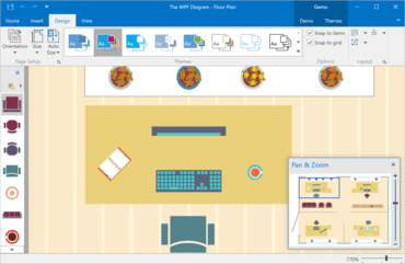
- Pan and Zoom Window - You can now pan and zoom by using the Diagram Control's Pan and Zoom window. The blue box indicates the region of the page that is shown in the drawing window. Resize the blue box by dragging a side until it fits the area that you wish to magnify. To pan the diagram, drag the blue box over the section you want to view.
- Splitting the RightAngle Connector - When the DevExpress Diagram Control calculates routes for RightAngle connectors, it tries to find the closest route from start to finish. This can result in overlaps when multiple connectors originate from the same point. Many of you have asked us to deliver an alternative solution to help reduce confusion. In v18.2, the Diagram Control allows you to split connectors and define the minimum acceptable distance between them.
- Diagram Viewer - With this release, you can switch to "view only" mode and disable all operations that can affect the diagram itself. New options allow you to define which operations are allowed and hide the rest.
- Item Selection Modes - The Diagram Control's selection modes now include:
- None - Item selection is disabled.
- Single - Only one item can be selected.
- Multiple - Multiple items can be selected/deselected via the mouse.
Editors
- Calendar Control - New Fluent View - The new FluentUI View for the Calendar Control supports Acrylic and Reveal Highlight effects and allows you to mirror the appearance of the Windows 10 calendar.
- CheckEdit - New SVG Check Styles - CheckEdit check styles have been extended. New SVG check styles are more attractive and support all the benefits that come with the use of vector-based icons (scaling without quality loss, automatic color adaptation based on the current skin and palette).
- Filtering UI Context Enhancements
- The ResetBinding/ResetBindings methods allow you to manually refresh editor values.
- The AddField method allows you to add custom editors bound to desired data model fields.
- Items can be customized in Filtering Events via the WithDataItems method. For instance, you can now assign custom HTML Text to display item images.
Navigation UI
- Office Navigation Bar - Tab Navigation View - With this release, you can easily create tab navigation options like those found in Microsoft Outlook and Visual Studio – user experiences with a modern appearance and borderless tab headers.
- NavBar to Accordion Converter - The DevExpress WinForms Accordion control extends the capabilities found in the NavBar control. If you are still using the NavBar control and want to replace it with the Accordion while preserving customization settings and paint styles, click the 'Convert to AccordionControl' smart tag. Note that event handlers are not converted. You will need to handle all item interaction events manually.
PDF Viewer
- DirectX Rendering - DirectX rendering was first introduced in May 2018 as a community technology preview (CTP). This update marks its official release. DirectX Rendering is now used as the default rendering engine.
Pivot Grid
- Unbound OLAP Fields - You can assign an OLAP Multidimensional Expression (MDX) to a PivotGrid field and create an Unbound Field for OLAP. You can also use the OLAPQueryData event to obtain an MDX query (used by the pivot grid to request data).
- Performance Enhancements - The Pivot Grid's in-memory data processing engine and now support the following features in Optimized Mode:
- Custom Types
- Custom Totals
- CustomSummary event
- CustomGroupInterval event
- CustomFieldSort event
- Legacy TopN
- Summary Filter
- FileDataSource
- CustomUnboundFieldData event
- Case-sensitive data binding.
- This release also adds an OptimizeSummaryTypeCalculation option. Enable this option to accelerate data aggregation speed with int/float/double numbers in Optimized Mode.
- In-Cell Data Editors - With this release, the Pivot Grid is a descendant of the EditorContainer class - this means you can assign editor Repository Items in the same manner as you would with the WinForms Data Grid, Tree List, and other data-aware controls. Invoke the Pivot Grid designer and switch to its “In-place Editor Repository” tab to create and modify individual editors. To assign these editors to data fields, go to the Fields section and specify a field's FieldEdit properties.
- Miscellaneous Enhancements
- HTML Formatting - format field values and row headers via HTML tags.
- Enhanced customization form.
- Ability to customize the Filter Editor before it is displayed by handling the FilterEditorCreated event.
- Ability to show/hide the loading panel (the LoadingPanelVisible property).
- The Excel Style Filter popup can now retrieve filter values in a background thread, allowing the entire application to remain responsive while this operation is in progress.
- Interval Grouping via a Group's Context Menu - Use the 'OptionsMenu.ShowDateTimeGroupIntervalItems' option to specify which interval grouping items (day, month, year, etc.) to display within the group context menu.
Ribbon, Bars and Dock UI
- Office 2019 Style - This release replicates the look and feel of the latest version of Microsoft Office. The Office 2019 Style includes new tab styles, animation effects, and the ability to minimize the Ribbon to a single-row tabbed toolbar.
- Right-Aligned Page Groups - With this release, Ribbon page groups can be aligned to the right (the Alignment property). Group alignment is supported by all Ribbon styles except TabletOffice.
- Ribbon Caption Bar - The DevExpress WinForms Ribbon Control now provides the CaptionBarItemLinks collection that hosts item links, displayed in the caption area of a corresponding Ribbon Form.
- Performance Enhancements - The engine used by the Office and Excel inspired controls has been changed to auto-generate a Microsoft-inspired Ribbon UI (Rich Editor, Spreadsheet, Analytic Dashboards, etc).
- Miscellaneous Enhancements - You can now hide maximized MDI form buttons by setting the BarManager's AllowMdiChildButtons property to 'false'.
Rich Text Editor
- RTL Support - With this release, you can load, display, print and export (to PDF) documents with the right-to-left text direction.
- Shape Support - Documents that contain shapes can now be displayed, printed and exported to PDF.
- Paragraph Borders - With this release, you can load/save, display, print and export (to PDF) documents with paragraph borders.
- Continuous Section Breaks - The WinForms Rich Text Editor allows you to load, display, print and export documents with continuous section breaks. This option is available via the control's Ribbon UI and its API.
- Paragraph Options - This release includes two new paragraph options:
- Widow/Orphan Lines Control - prevents the first or last paragraph line from appearing at the bottom or top of a page.
- Keep with Next - keeps multiple paragraphs on the same page.
- It also enhances the 'Keep lines together' option to mirror Microsoft Word.
- All these options are available in code and via the control's UI.
Scheduler
- Google Calendar Syncronization - The WinForms Scheduler can now automatically synchronize appointments with Google Calendar. Data can be synced in both directions, which means that all changes made in your WinForms application will be automatically reflected in Google Calendar.
Skins and Vector Icons
- New SVG Office 2019 Colorful Skin - v18.2 ships with a new vector-based skin and associated color palettes - Office 2019 Colorful.
- Advanced Design-Time Image Picker - As you know, when an application includes multiple forms with a large number of controls, changing icons (replacing raster graphics with vector images) may be quite time consuming. The new Image Picker makes this process much easier. It allows you to drag-and-drop icons onto controls. Integrated smart search allows you to quickly locate the desired icon.
- 7 New SVG Palettes - The Bezier Skin
- High-contrast palettes:
- High Contrast White
- High Contrast Black
- Visual Studio-inspired palettes:
- DevExpress palettes:
- Skin Colors - You no longer need to hunt for a perfect hue to match an existing application theme when you set a custom background/foreground color for UI elements. Skin Colors remain consistent with the currently applied application theme. Skin Colors is a set of predefined colors that match the current skin and/or skin palette.
- Vector Image Gallery This release improves the SVG image gallery by adding new SVG graphics, advanced filtering and search capabilities.
- Extended SVG Support - This release replaces bitmap icons in the data editors, dialog windows and forms. It is also possible to specify a vector-based icon for each state of context buttons, BackstageViewControl and RecentItemControl items (normal, hovered, pressed, etc.). If you need to display a grayed-out icon when a button is disabled, and a highlighted icon when the button is pressed, specify SVG for the Normal state only. The graphics engine will automatically re-paint it when required.
- Miscellaneous Enhancements
- Lightweight Custom Skins: Custom skins now store only differences from the source (template) skin. This makes them 90% lighter.
- Custom skins no longer store the parent’s skin version. You do not need to upgrade your custom skins with the Skin Editor. Create a custom skin once and it will automatically obtain all updates from its parent skin whenever you upgrade your application to a new version.
- The 'External Application Preview' feature allows you to preview custom skins in any C#/VB application.
- The Palette Editor allows you to preview custom palette colors before you confirm changes by clicking 'OK'. To invoke the editor press F7.
Spreadsheet
- Shape API - This new API allows you to create new shapes, connect and group shapes, change a shape’s fill and outline settings, add text to a shape, and remove shapes from a document.
- Sparkline Rendering - With this release, the WinForms and WPF Spreadsheet controls can display sparklines. Documents with sparklines can also be printed and exported to PDF.
- Search in the AutoFilter Dialog - The WinForms and WPF Spreadsheet controls now ship with a Search box in the AutoFilter dialog. This feature allows you to quickly locate items to use within a filter.
- Rich Text API - The updated API allows you to create and edit rich text within a cell.
Tree List
- Breadcrumb Navigation - The TreeList and BreadcrumbEdit controls can now interact with one another and share data. This allows you to reproduce the Windows File Explorer UX with ease.
- Performance Enhancements - In the last release, DirectX hardware acceleration support was introduced which boosted TreeList rendering on High DPI devices. In v18.2, the rendering engine has been improved and made the control significantly faster. Enhancements have been made to common usage scenarios including like repainting, batch updates, the processing of large amounts of data, etc.
- Hierarchical Data Binding - The DevExpress WinForms TreeList allows you to bind to hierarchical data sources (for example, a list of lists). It will automatically traverse through the entire hierarchy and build the corresponding tree layout.
- Options Tree Support - With this release, you can mix radio buttons and check boxes in order to construct an advanced option tree. Use the node's Node.ChildrenCheckBoxStyle property to specify the type of option element to display for child nodes.
Vertical Grid
- Excel-inspired Group Filters - Excel-inspired group filters were first introduced in May 2018 for both the WinForms Pivot Grid and TreeList controls. With this update, this feature is extended to the WinForms Vertical Grid control. Filter dropdowns can now group filter items from two or more data fields, and display results as a hierarchical checked list.
Miscellaneous
- WYSIWYG and Data Aware Export Enhancements - Data-aware controls that support HTML text can now be printed and exported in both Data Aware and WYSIWYG modes.
- Workspace Manager Enhancements
- The WorkspaceManager.ShowPathColumnInWorkspacesDialog property allows you to hide the Path column in the Workspaces dialog.
- The WorkspaceManager.SaveTargetControlSettings property allows you to save target form properties (Bounds and State).
- The SaveWorkspaces/LoadWorkspaces method saves/restores all workspaces to/from a single file.
- Excel Filter Enhancements
- Excel filters now automatically recognize whether an enumeration is nullable, and display or hide 'Is Null' / 'Is Not Null' items accordingly.
- 'Values' and 'Filters' tabs now account for in-place ImageComboBox editor settings and automatically display related images.
- Scrollbars for tabs with checkboxes can now display scrollbar annotations.
- Project Settings Enhancements
- If you open DevExpress Project Setings for a project without DevExpress libraries, the page will display a 'Convert' button so you can automatically add core DevExpress libraries.
- The Register Bonus/User Skins option allows you to quickly register corresponding skins.
- Reworked font, skin and palette selectors to help improve usability.
- ToastNotificationManager Enhancements - With this update, you can handle user inputs (text and selection), respond to button clicks as well as persist your application toast notifications in Action Center.
- Fluent UI Scrollbar - The scrollbars now support Microsoft's Fluent UI. When used, a scrollbar is collapsed to a thin stripe when not active, and expands to a semi-transparent bar when a user hovers the mouse pointer over it. To enable Fluent UI Mode, set the WindowsFormsSettings.ScrollUIMode property to 'Fluent'.
- DirectX - Performance Enhancements - DirectX rendering engine has been improved which means HighDPI support is a reality on the WinForms platform.
↧
November 9, 2018, 2:53 am
Data GroupingNew Spreadsheet (CTP), Core Rich Text Editor (CTP) and Reporting for ASP.NET Core.
Features
ASP.NET Controls
New Adaptive Project Template
- All pages within the adaptive project template now include responsive layouts.
CardView
- Data Grouping - The ASP.NET WebForms and MVC CardView allows you to group data against multiple columns.
Charting
- Pane Layout Enhancements
- Ability to add individual titles to each pane.
- You can hide a pane by clicking its title.
- Panes can be displayed using a grid layout.
- Drill Down Chart - The ASP.NET and MVC Chart Control now supports nested Series Templates - allowing you to implement drill-down enabled charts with ease. You can create endless drill-down levels and use the control's integrated Breadcrumb navigation option to move across your data hierarchy.
Editors
- Database Server Mode in ComboBox and TokenBox - Both the ASP.NET WebForms and MVC List Editors now support Database Server Mode. When used, list editors only load visible items and execute data-aware operations (such as filtering) on the database server.
- Drop-Down Editors - Adaptivity Enhancements - In this release, both WebForms and MVC Drop-Down Editors can switch to modal mode based upon browser width.
- Month-Year Picker - The ASP.NET WebForms and MVC Calendar (DateEdit) now supports month-year selection mode.
- Date Edit - Scroll Picker Mode - The ASP.NET and MVC Date Edit provides a new scroll selection mode. When used, the Date Edit displays date components (day, month, year, time) using an independently rotating wheel (making date selection on touch devices much easier).
- Button Render Styles - New predefined render styles allow you to define additional semantics and indicate possible user actions: Danger, Outline, Secondary, New Item, Native.
File Manager and Upload Control
- OneDrive and Google Drive Support - The ASP.NET and MVC File Manager and Upload Controls allow you to upload and manage files and folders in OneDrive and Google Drive.
Form Layout
- Data Annotation Attributes - With the Form Layout control, you do not have to bind each individual editor to data and provide label captions corresponding to field names. You simply bind the control to a data source and specify which fields are to be displayed on a page. With this release, you can specify default settings for individual editors by applying Data Annotation attributes to data source fields. You can use the following Data Annotation attributes:
- BrowsableAttribute
- RequiredAttribute
- RegularExpressionAttribute
- RangeAttribute
- DisplayFormatAttribute
- DisplayAttribute
- DataTypeAttribute
GridView
- Callback Support in Batch Edit - The ASP.NET GridView now supports callbacks in batch edit mode - The control will not lose unsaved changes when an end-user filters, pages, groups or sorts data.
- Preview Changes in Batch Edit - Inserted, edited and deleted rows can now be previewed and modified before data is saved in Batch Edit mode.
- Adaptivity Enhancements in Fixed Table Layout Mode - Improved the GridView and made it more adaptive in fixed table layout mode. With this release, you can specify a column's minimum and maximum width.
Menu
- Collapse to Images - To help reduce control width when the browser screen is narrow, the ASP.NET Menu can now hide item text and only display icons.
Pivot Grid
- New Filter Popup - Replaced the previous Filter Popup with a new implementation and integrated search option. This new dialog and associated scrolling speed is up to 3x times faster in WebKit/FF Browsers, and up to 5x times faster in Internet Explorer.
- Unbound OLAP Fields - You can assign an OLAP Multidimensional Expression (MDX) to a PivotGrid field and create an Unbound Field for OLAP. You can also use the OLAPQueryData event to obtain an MDX query (used by the pivot grid to request data).
- Performance Enhancements - Improved the Pivot Grid's in-memory data processing engine and now support the following features in Optimized Mode:
- Custom Types
- Custom Totals
- CustomSummary event
- CustomGroupInterval event
- CustomFieldSort event
- Legacy TopN
- Summary Filter
- FileDataSource
- CustomUnboundFieldData event
- Case-sensitive data binding.
- Also added an OptimizeSummaryTypeCalculation option. Enable this option to accelerate data aggregation speed with int/float/double numbers in Optimized Mode.
Rich Text Editor
- Simple View (Web Layout) - You can now view documents in Simple View mode. In this view mode, the document is not split across multiple pages, nor does it have margins, headers or footers.
Scheduler
- Floating Action Button - The Scheduler's new Floating Action button triggers the following actions:
- Create a new appointment
- Edit an appointment
- Delete an appointment.
- Appointment Tooltips (Mobile) - This release adds tooltip support for appointments.
- Performance Enhancements - The Scheduler control now renders up to three times faster in Edge and Chrome.
- View Visible Interval UI Enhancements - The new View Visible Interval within the ASP.NET Date Navigator makes navigation across appointments much easier.
Spreadsheet
- Pivot Tables - With this release, you can now embed pivot tables within worksheets. The Excel-inspired pivot table allows you to incorporate multi-dimensional data analysis and cross-tab reporting to any ASP.NET and MVC web app with ease. As you would expect, numerous layout customization options give you total control over its user experience.
- Cross Sheet Formula Editing - End-users can now use cell values from any worksheets to create formulas for the active worksheet.
- New Behavior Settings - New behavior settings allow you to prevent end-user actions on worksheets, columns, and rows.
New ASP.NET Core Spreadsheet (CTP)
- With this release, you can incorporate spreadsheet functionality to any ASP.NET Core application with absolute ease. The new Spreadsheet control is made available as a community technology preview (CTP). Features include:
- Cell Editing and Formatting
- Formulas
- Charts
- Sorting
- Comments
- Read-only Mode
ASP.NET Core Rich Text Editor (CTP)
- The new Rich Text Editor ships with everything you'll need to quickly incorporate advanced text editing functionality in your next ASP.NET Core application. Its features include:
- Character and Paragraph Formatting
- Bullets and Numbering
- Tables
- Hyperlinks and Bookmarks
- Floating Objects
- Auto Correct
- Document Protection
ASP.NET Core Reporting
- v18.2 marks an official release of the ASP.NET Core Reporting. You can create ASP.NET Core applications that target both .NET Framework and .NET Core. New features include:
- Event Handling
- Report Designer Integrated in Visual Studio
DevExtreme ASP.NET Core Controls
- All DevExtreme HTML5/JS Control features are also available in DevExtreme ASP.NET Core Controls.
ASP.NET Bootstrap Controls v18.2
New File Manager - The new ASP.NET Bootstrap File Manager control allows you to reproduce the Windows File Explorer UX in your next web app. Its features include:
- Ability to display file and folder structures
- Both Thumbnail and Details view modes
- File/folder operation support: create, rename, copy, move, delete
- File system providers: physical, data source, cloud storage Amazon / Azure / Dropbox.
- File upload and download
- Ability to define access permissions for folders and files.
New Ribbon Control - The new ASP.NET Bootstrap Ribbon control ships with all the tools you'll need to emulate the Microsoft Office end-user experience within your next Web project. Its features include:
- Over 10 item types: Button, Check Box, Color Button, Combo Box, Date Edit, Drop-Down Buttons, Galleries, and many more...
- Data Binding
- Keyboard Support
- Quick Access Toolbar
- Adaptivity and Templates Support
- Client-side API
New Rich Text Editor (CTP) - The new ASP.NET Bootstrap Rich Text Editor allows you to integrate advanced text editing functionality into your next web application. It ships with comprehensive text formatting options and a rich collection of end-user options so you can deliver Microsoft Word-inspired functionality with ease. Features include:
- Text formating
- Spell checking
- Mail merge
- Save & Export to various formats
- Insertion of tables, lists, images, hyperlinks, and etc.
- Document management
New Spreadsheet (CTP) - The new ASP.NET Bootstrap Spreadsheet control allows you to deliver Excel inspired functionality with minimal effort. Its features include:
- Worksheet protection
- Printing
- Sorting & Filtering data
- Graphical data presentation via charts
- Specifying formulas
- Inserting images
New Themes
- This release includes two new themes for ASP.NET Bootsrap: OfficeWhite and Purple. These themes were designed for websites built using Bootstrap 4 or later. You can download both themes free of charge.
CardView
- Vertical Scrolling and Endless Paging - The Bootstrap CardView now supports both a Vertical and Horizontal Scrollbar. Also simplified record navigation with on demand record scrolling. To give you maximum UI flexibility, the Bootstrap CardView ships with Endless Paging support. As its name implies, Endless Paging allows users to navigate an entire dataset without using a data pager. The following Endless Paging options are available:
- Show More Cards - Additional cards are loaded when the 'Show more cards' link is clicked;
- On Scroll - Additional Cards are loaded when the control is scrolled.
Form Layout
- Data Annotation Attributes - With the Form Layout control, you do not have to bind each individual editor to data and provide label captions corresponding to field names. You simply bind the control to a data source and specify which fields are to be displayed on a page. With this release, you can specify default settings for individual editors by applying Data Annotation attributes to data source fields. You can use the following Data Annotation attributes:
- BrowsableAttribute
- RequiredAttribute
- RegularExpressionAttribute
- RangeAttribute
- DisplayFormatAttribute
- DisplayAttribute
- DataTypeAttribute
GridView
- Scrollbars - With this release, the Bootstrap Data Grid supports both Vertical and Horizontal scroll bars.
- Fixed Columns - With this release, you can anchor columns to the left of the grid. These fixed columns are never scrolled horizontally and as such, allow you to create solutions that offer improved readability and visual clarity.
- Endless Paging - To give you maximum UI flexibility, the Bootstrap GridView ships with Endless Paging support. Endless Paging allows users to navigate an entire dataset without using a data pager.
- Context Menu - A context menu is displayed when an end-user right-clicks an individual Bootstrap Data Grid element.
↧
November 9, 2018, 3:52 am
Diagram Pan and Zoom Window Diagram control adds Pan and Zoom window, plus introduces a new WPF Gantt Control (CTP).
Features
New WPF Gantt Control (CTP)
- The new WPF Gantt Control is now available as a community technology preview. It's features include:
- A tree view region with the TreeList Control (sorting, filtering, presentation options, etc.).
- A Gantt area with time scale and associated UI elements (tasks, summary tasks, milestones, connectors).
- Built-in scrolling and zooming.
- Four types of dependencies between individual tasks (Finish to Start, Finish to Finish, Start to Start, Start to Finish).
- API to configure work time, weekends and special dates as well as the ability to hide/highlight items within the Gantt region.
- Ability to use built-in Gantt data objects or map your custom data objects to Gantt task properties.
Charting
- Pane Layout Enhancements - Add an individual title for each pane, to hide a pane by clicking its title. Panes can be displayed using a grid layout.
- Zooming and Scrolling Enhancements - The WinForms and WPF Chart controls now support keyboard navigation. New settings allow you to configure hotkeys. Hotkeys can also be used to affect the behavior of mouse buttons when zooming in/out or zooming to a rectangle. With this release, end-users can zoom a specific axis element using the mouse wheel when the mouse pointer hovers over an axis label.
- Crosshair Label Can Display Indicators - The Chart Control's Crosshair Cursor can now display Technical Indicators. The Indicator's API has been extended and made to be similar to the Series API. All settings available for a series are now available for an indicator.
Data Grid and Tree List
- New Data Filter Editor (CTP) - This release includes a new Filter Editor control and offers the following advantages over its predecessor:
- A list of fields is displayed with a search box.
- You can select one of the values within the data source as a filter value.
- The Filter Editor displays record count next to each filter value.
- You can define and use named filters in the Filter Editor.
- Custom Cell Editor Support - The Grid and TreeList controls now provide an API to implement keyboard navigation and support data validation for non-DevExpress editors used in cell templates. It also provides two additional templates for grid cells - CellDisplayTemplate and CellEditTemplate. These templates make it easier to define cell display for Display/Edit modes individually.
- Filtering UI Blocks (CTP) - v18.2 introduces Filtering UI Blocks - separate controls allowing you to filter data in the Grid and TreeList controls. Simply connect a filter element to a supported control and specify the fields to filter against.
- Row/Cell Hover Highlighting - To help improve usability, the WPF Data Grid and Tree List controls can highlight rows and cells when a user hovers them with the cursor. To enable hover highlighting, activate the 'HighlightItemOnHover' option. You can also change default appearance settings (e.g. foreground and background colors) and display custom elements within a hovered row/cell.
- Filtering Enhancements - The Excel-inspired Filter Dropdown ships the following new features:
- Display record count next to distinct values
- Named filters
- Check Column - Columns with Boolean values can now display a check box within the header to toggle the check state of all rows.
- Miscellaneous Enhancements
- Custom cell styles automatically inherit visual settings from the selected theme. With this release, you don't need to use the BasedOn property.
- The PrintRowIndentWidth property allows you to set or remove indentation before printed/exported child rows.
- The ShowRibbonPrintPreview method allows you to display the Print Preview dialog with a Ribbon instead of Toolbars.
- Vector-based icons for Conditional Formatting rules are now available.
Diagram
- Pan and Zoom Window - You can now pan and zoom by using the Diagram Control's Pan and Zoom window. The blue box indicates the region of the page that is shown in the drawing window. Resize the blue box by dragging a side until it fits the area that you wish to magnify. To pan the diagram, drag the blue box over the section you want to view.
- Splitting the RightAngle Connector - When the DevExpress Diagram Control calculates routes for RightAngle connectors, it tries to find the closest route from start to finish. This can result in overlaps when multiple connectors originate from the same point. Many of you have asked us to deliver an alternative solution to help reduce confusion. In v18.2, the Diagram Control allows you to split connectors and define the minimum acceptable distance between them.
- Diagram Viewer - With this release, you can switch to "view only" mode and disable all operations that can affect the diagram itself. New options allow you to define which operations are allowed and hide the rest.
- Item Selection Modes - The Diagram Control's selection modes now include:
- None - Item selection is disabled.
- Single - Only one item can be selected.
- Multiple - Multiple items can be selected/deselected via the mouse.
Docking
- New Panel Dragging Mode - With this release, a dock panel can temporarily hide its content until a user drops it at a desired location. The new DockLayoutManager.ShowContentWhenDragging property specifies whether to display panel content while dragging a panel. By default this option is enabled. For complex panels, this options should be deactivated.
- Light Mode - To help create a more "lightweight" UI, the new Light mode merges borders between dock panels.
- Miscellaneous Enhancements
- Floating panels now display their image and caption in the taskbar preview. You can also use the FloatGroup.WindowTaskbarTitle and FloatGroup.WindowTaskbarIcon attached properties to specify a different caption and image.
- Panels can now display CaptionTemplate content in the Customization Window and menus.
- DockLayoutManager can now save and restore the state of panels dragged from another DockLayoutManager instance.
- The new ContextMenuCustomizationsTemplate property allows you to customize the context menu for panels and groups in a Style.
Editors
- Date Navigator and Date Edit Enhancements - The WPF Date Navigator ships with the following new features:
- Min/Max dates
- New API to specify disabled and highlighted dates dynamically
- Ability to obtain the visible date range
- A new Microsoft Outlook-inspired style with a compact header.
- This release also integrates the Date Navigator into the WPF Date Editor's drop-down. This expands the Date Editor's capabilities with new features like disabled and highlighted dates.
- CheckEdit - Glyph Support - The WPF CheckEdit can now display glyphs instead of a check box. You can set a glyph using the CheckedGlyph, UncheckedGlyph, IndeterminateGlyph, and GlyphTemplate properties.
- Custom Filters - With this release, the DevExpress WPF ComboBox and LookUp editors ship with a SubstituteDisplayFilter event allowing you to change your filter once it has been entered into the edit box. You can filter items based on values from multiple columns or implement custom filtering and allow for typos or replace characters with umlauts.
Mapping
- Map Editor - Vector items can now be edited by end-users. Once a vector layer has been modified, it can be saved to a file (Shapefile, SVG or KML).
MVVM Framework
- Both the BindableBase and ViewModelBase classes now offer a more simplified syntax for getters and setters.
- CompositeCommandBehavior - the new CanExecuteCondition property specifies whether the command target should be disabled when the CanExecute method of one of the commands returns true.
- The Prism Adapters library now supports Prism 7.
PDF Viewer
- DirectX Rendering - With this release, the WPF PDF Viewer supports DirectX rendering (enabled by default). Its features include:
- High-quality text rendering (GDI uses integer coordinates for glyph positioning) and improved text antialiasing (especially for Type 1 fonts).
- Performance gains across a broad range of usage scenarios
- Support for all blend modes.
- Support for all text rendering modes (e.g. using text as a clip region for a drawing).
Pivot Grid
- Unbound OLAP Fields - You can assign an OLAP Multidimensional Expression (MDX) to a PivotGrid field and create an Unbound Field for OLAP. You can also use the OLAPQueryData event to obtain an MDX query (used by the pivot grid to request data).
- Performance Enhancements - This release improves the Pivot Grid's in-memory data processing engine It also adds an OptimizeSummaryTypeCalculation option. Enable this option to accelerate data aggregation speed with int/float/double numbers in Optimized Mode.
- Data-Aware Export - The DevExpress WPF PivotGrid Control uses the powerful Excel data export engine.The following Pivot Grid features are fully supported:
- Data Grouping (Outline)
- Fixed Columns
- Cell Formatting - exporting number format
- Ability to select whether to export display text or values.
Ribbon and Toolbars
- Lightweight Templates - Office2016SE and VS2017 themes use lightweight templates to render bar items by default. This improves initial load times and merge operations (in applications that use Toolbars or the Ribbon).
- MDI Merge Performance - With this release, the WPF Ribbon control reuses visual elements for bar items, pages, and groups when merging forms. This improves MDI Merge performance when loading views with nested Ribbons or switching between document tabs.
Rich Text Editor
- RTL Support - In v18.2, you can load, print and export (to PDF) documents with the right-to-left text direction.
- Shape Support - Documents that contain shapes can now be displayed, printed and exported to PDF.
- Paragraph Borders - With this release, you can load/save, display, print and export to PDF documents with paragraph borders.
- Continuous Section Breaks - In v18.2, the WPF Rich Text Editor allows you to load, display, print and export documents with continuous section breaks. This option is available via Ribbon UI and implemented API as well.
- Paragraph Options - This release includes two new paragraph options:
- Widow/Orphan Lines Control - prevents the first or last paragraph line from appearing at the bottom or top of a page.
- Keep with Next - keeps multiple paragraphs on the same page.
- It also enhances the 'Keep lines together' option to mirror Microsoft Word.
- All these options are available in code and via the control's UI.
Scheduler
- Agenda and List Views - The WPF Scheduler has two new views:
- Agenda View - a compact representation of a daily schedule.
- List View - displays appointments exactly as they are stored in the database. Appointments are listed in a grid with integrated search, filtering, sorting, and grouping.
- Appointment Arrows - Appointments that don’t fit into the visible range can now display start and end info.
- Miscellaneous Enhancements
- The Scheduler can now automatically synchronize scroll position and settings changed at runtime between DayView, WorkWeekView, and WeekView.
- The Scheduler now listens to nested property changes in a data source and automatically updates linked appointments.
- New options allow you to better configure appointments.
Spreadsheet
- Shape Rendering Enhancements - The DevExpress WPF Spreadsheet control can render shape effects (e.g. shadow, reflection, glow, and soft edges).
- Shape API - This new API allows you to create new shapes, connect and group shapes, change a shape’s fill and outline settings, add text to a shape, and remove shapes from a document.
- Sparkline Rendering - With this release, the WinForms and WPF Spreadsheet controls can display sparklines. Documents with sparklines can also be printed and exported to PDF.
- Search in the AutoFilter Dialog - The WinForms and WPF Spreadsheet controls now ship with a Search box in the AutoFilter dialog. This feature allows you to quickly locate items to use within a filter.
- Rich Text API - The updated API allows you to create and edit rich text within a cell.
Themes
- Theme Designer - Template Editing - With this release, you can locate and modify control templates, create custom themes and apply color presets.
- Additional enhancements include:
- An effortless way to locate the required template and navigate between templates in code.
- Automatic theme upgrade option once a new version of the WPF Subscription is released.
- Ability to import old themes created in the Theme Editor.
- Palette Theme Keys - Modern themes with color palettes (Office2016SE, VS2017) expose their palette colors and brushes as resources.
- Themed Window Enhancements - The Themed Window can now act as a dialog window and show dialog buttons defined in XAML or code behind. This release also replaces the legacy DXMessageBox with ThemedMessageBox that matches the ThemedWindow's style. Both dialog windows (ThemedWindow and ThemedMessageBox) can be used on a standalone basis and in the MVVM services.
Tree List
- Data Sorting Performance Enhancements - Data sorting is now up to two times faster when compared to previous versions.
- Miscellaneous Enhancements
- The CheckBoxFieldName property supports complex paths to nested properties (e.g., "Order.IsProcessed").
- The TreeList control can now detect cross-thread operations and maintain data consistency. If data is changed from another thread, the TreeList control throws a cross-thread exception.
↧
↧
November 9, 2018, 4:21 am
Focused Row and Keyboard Navigation EnhancementsNew API to control DataGrid and TreeList focused row operations, plus improves Angular, React and Vue support.
Features
New Push Notification API
- This new release addresses the needs of those who are building apps that display/render real-time data. With this release, you can integrate DevExtreme controls with your SignalR server (or any other notification service).
Real-time UI Updates
- New DataSource options include:
- reshapeOnPush - specifies if sorting, grouping, paging and other shaping operations should be applied on push notification;
- pushAggregationTimeout - specifies the period within which the arrived notifications are aggregated into a batch.
Data Grid & Tree List
- Live Update and Performance Enhancements - To address the most popular usage scenarios, this release has extended the Grid's and TreeList's API in the following manner:
- 'repaintChangesOnly' - if set to 'true', push updates don't force the component to fully re-render. The new change tracking strategy updates only the modified portion of the component UI.
- 'editing.refreshMode' - specifies control behavior once a row is edited
- 'full' - requests new data from server, shapes and renders it;
- 'reshape' - reshapes local data and renders it;
- 'repaint' - re-renders local data without reshaping;
- 'summary.recalculateWhileEditing' - enables real-time summary recalculations while editing (for client-side summaries only)
- 'highlightChanges' - enables visual highlighting of updated cells.
- Focused Row and Keyboard Navigation Enhancements - This release introduces a new API to control DataGrid and TreeList focused row operations. This feature is useful when you need to display Master-Detail relationships, navigate through records and view details in a side-by-side view. You can also use mouse or keyboard to navigate through rows. The new API allows you to implement custom keyboard navigation through individual cells.
- Excel Data Export Customization Enhancements - This release has extended the capabilities of the Excel data export engine so you can control the appearance of exported data more effectively (font, background color, etc.).
- Command Column Customization - This release includes new command column customization options for the DataGrid and TreeList controls. These include:
- Specify command column width, position, or template
- Fix, or 'pin', a command column to the left or right
- Add a custom command button to the 'edit command' column
- Add any number of custom command columns
- Hide or show command buttons for specific rows
Data Visualization
- New Sankey Diagram Component - The new Sankey component will help you visualize data as flows or relationships between different parts of systems. This widget supports the following features:
- Several predefined palettes, including a Material-style palette
- Node alignment and reordering
- Title and subtitle
- Client-side export and printing
- Tooltip Support
- User interactions (hover, click)
- Real-Time Chart Updates - Added support for real-time data updates within a Chart without a full chart redraw. When a new point arrives, you can use one of the following behaviors:
- Keep - new data doesn't affect what you see
- Shift - new data shifts the visual range
- Reset - new data redraws the chart
- Auto - the chart's behavior depends on the current visual range position
- This release also includes uninterrupted navigation during data updates (you can zoom, scroll and explore a chart while it is updated in the background). You can also jump to your new data and view it in real-time.
- Zoom/Scroll Enhancements - This release refines the JavaScript Charting library to support the following:
- Zoom a chart by its Value-axis
- Select the desired area using your mouse (or via a gesture on touch devices)
- Save zoom level on data updates
- Scroll/Zoom to areas without data
- A Chart is continuously updating during zooming/scrolling operations
Scheduler
- Group by Date - You can now group Scheduler appointments first by date and then by resources.
UI Widgets
- New HTML/Markdown WYSIWYG Editor (CTP) - This release introduces a new rich WYSIWYG text editor. This UI widget allows you to change text styles, create lists and add hyperlinks and images. Both HTML and Markdown target markup formats are available.
- DateBox - Masked Input - The DateBox widget allows you to specify a date mask and control user input as needed.
- New Drawer Component - This release includes a new Drawer component for building responsive application layouts. It can be used to implement collapsible navigation, information, and tool panels. With a wide range of configuration options, you can specify Drawer position, reveal animation, open/close behavior and more.
- New ButtonGroup Component - The new ButtonGroup component consists of a set of toggle buttons. Both single and multi-select modes are available.
- File Uploader Enhancements - This release includes the following client-side file validation options for the File Uploader widget:
- allowedFileExtensions
- minFileSize
- maxFileSize
- Filter Builder API Enhancements - You can now limit Filter Builder group nesting and specify available operations.
- Performance Enhancements - The List, Accordion and TabPanel components now support partial UI updates. Use the new 'repaintChangesOnly' option to enable this feature.
- New Button and Editor Styles - You can now customize button and editor appearance as business needs dictate. Buttons ship with the following styling modes: "Contained", "Outlined" and "Text". Editor styling modes include: "Outlined", "Filled" and "Underlined". New styles are available for both Material and Generic themes.
Themes
- Color Swatches - You can now create and use multiple DevExtreme color schemes within the same application. For instance, you can implement a dark navigation sidebar with a light content area. This feature is available in the both ThemeBuilder UI and CLI tools.
- DevExtreme CLI - Custom Theme Generation - The new ThemeBuilder CLI allows you to generate custom DevExtreme color schemes and save them as a CSS file without using the ThemeBuilder UI. You can also use the DevExtreme theme variables within your app to deliver a more consistent UI. Use the ThemeBuilder CLI to export any theme variable as LESS or SASS file.
- New ThemeBuilder UI - The new ThemeBuilder UI ships with a more intuitive UX and supports new theming capabilities such as Color Swatches.
- A Dark Set of Material Design Themes - A set of new 5 dark Material Design themes are available in v18.2. You can use them 'as is' or inherit a custom dark Material Design theme.
MVC Controls
- Bootstrap 4 in MS Visual Studio Project Templates - This release upgrads the Twitter Bootstrap version in the MS Visual Studio Project templates. You can now utilize all the advantages of the Bootstrap 4 CSS Framework.
Angular Components
- Responsive Application Layout Template for Angular - The new Application Layout template is integrated with the new DevExtreme CLI tools.
- DevExtreme CLI - Angular Apps and Views Generation - v18.2 introduces new CLI tools. You can now bootstrap Angular CLI based applications that are tightly integrated with DevExtreme. DevExtreme CLI utilizes the new Application Layout template and build-time theming capabilities. You can also add Angular views with DevExtreme components into your existing applications.
- MS Visual Studio Angular Views Scaffolding - With this release, you can scaffold Angular views into your Visual Studio Angular project. These views are built upon DevExtreme Angular components and bound to your ASP.Net Core CRUD API endpoints.
Vue Components
- DevExtreme Vue Wrappers (RTM) - The Vue Wrappers have been released to manufacturing and ship with the following enhancements:
- Rendering customization via named slots.
- 'v-on' directive support (and @ shorthand)
- Vue prop validation and type checks
- TypeScript support
- Child configuration components (for instance, 'dx-column' for DataGrid columns configuration).
- Data binding capabilities include:
- One-way data binding
- Two-way data binding ('.sync' modifier)
- 'v-model' support for data editors
- Also added new demos to the Widgets Gallery. All new DevExtreme widgets introduced in this release cycle are also available for Vue.
React Components
- DevExtreme React Wrappers (RTM) - v18.2 marks the official release of the React Wrappers. This update includes the following new features:
- Controlled and uncontrolled modes
- Rendering customization via native React template components or a render method (props with -Component or -Render postfixes)
- TypeScript support
- Type checking with React PropTypes
- Support for the 'className' and 'ref' React attributes
- Child configuration components (for instance, DxColumn for DataGrid columns configuration)
- New Native React Scheduler Component (CTP) - This release includes the first iteration of the native React Scheduler/Calendar control. The following features are now available:
- Week, Work Week and Month views
- Date and view choosers
- All-day panel
- Appointment tooltips.
- Native React Chart (CTP) - The DevExtreme React Chart widget was first introduced in May 2018 as a community technology preview. This update introduces the following new features:
- Stacked Series
- Non-Linear Axes Types
- Color Palette Management
- Animations
- Native React Grid - Fixed Columns - You can now anchor columns to the left or rightmost edge of the Grid. These fixed columns are never scrolled horizontally and as such, allow you to create solutions that offer improved readability and visual clarity.
- Native React Grid - Data Summary Rows - The React Grid component can now calculate a summary for all rows (total summary), row groups (group summary), and tree nodes that contain child nodes (tree summary).
↧
November 9, 2018, 4:33 am
New JavaScript Sankey Diagram ComponentMajor enhancements for JavaScript (Angular, React, Vue), ASP.NET Core, ASP.NET, WPF and Reporting.
Features
DevExpress has released a major update across their entire product range.
- CodeRush - Improves JavaScript and TypeScript support.
- DevExpress ASP.NET - New Spreadsheet (CTP), Core Rich Text Editor (CTP) and Reporting for ASP.NET Core.
- DevExpress Reporting - Adds a fully integrated Report Designer within Visual Studio for ASP.NET Core, plus better Angular app support.
- DevExpress Windows 10 Apps Subscription - Adds a new UWP Scheduler control (CTP) and a new Virtual Data Source for the Data Grid.
- DevExpress WinForms - New Sunburst chart lets you visualize hierarchical data in an elegant and compact manner.
- DevExpress WPF - Diagram control adds Pan and Zoom window, plus introduces a new WPF Gantt Control (CTP).
- DevExtreme - New API to control DataGrid and TreeList focused row operations, plus improves Angular, React and Vue support.
↧
November 9, 2018, 4:36 am
Word Processing Document APIMajor enhancements for JavaScript (Angular, React, Vue), ASP.NET Core, ASP.NET, WPF and Reporting.
Features
DevExpress has released a major update across their entire product range.
- CodeRush - Improves JavaScript and TypeScript support.
- DevExpress ASP.NET - New Spreadsheet (CTP), Core Rich Text Editor (CTP) and Reporting for ASP.NET Core.
- DevExpress Office File API - Sign PDF documents with visual signatures, create & connect shapes in Excel, plus adds RTL support in Word files.
- DevExpress Reporting - Adds a fully integrated Report Designer within Visual Studio for ASP.NET Core, plus better Angular app support.
- DevExpress Windows 10 Apps - Adds a new UWP Scheduler control (CTP) and a new Virtual Data Source for the Data Grid.
- DevExpress WinForms - New Sunburst chart lets you visualize hierarchical data in an elegant and compact manner.
- DevExpress WPF - Diagram control adds Pan and Zoom window, plus introduces a new WPF Gantt Control (CTP).
- DevExtreme - New API to control DataGrid and TreeList focused row operations, plus improves Angular, React and Vue support.
↧