November 12, 2018, 6:46 am
.Net Forms ResizeImproves and optimizes the resize engine, plus adds support for .Net Framework 4.7.1 & 4.7.2.
Features
- Improved and optimized resize engine.
- Added support and assembly for Microsoft .Net Framework 4.7.1.
- Added support and assembly for Microsoft .Net Framework 4.7.2.
Fixes
- Fixed a minor bug setting editing rectangle of TextBoxes with single border.
- Fixed a minor bug resizing TextBoxes with no border.
- Fixed a minor bug resizing TabControls tabs.
↧
November 15, 2018, 7:07 am
DevExpress VCL SubscriptionImproves Grid, PDFViewer, Printing, Scheduler and SpreadSheet controls.
Fixes
ExpressBars Suite
- Ribbon Form - A form maximized on a monitor is also partially visible on another monitor if the DisableAero property is True and the first monitor's DPI exceeds the system DPI.
ExpressEditors Library
- A glyph of the last visible gallery item created at runtime becomes invisible after calling the glyph's Scale procedure if the gallery shows a classic scrollbar.
- TcxDBTimeEdit - An exception occurs on appending a record to a dataset after changing a value in its field bound to the unfocused editor.
ExpressLayout Control
- The transparent background is incorrectly painted for controls embedded into tabbed groups after displaying a window within the layout control's BeginUpdate/EndUpdate method block if runtime themes are enabled.
ExpressLibrary
- SVG Images - The "fill-opacity" element attributes are ignored.
- SVG Images - The "path" elements that include Bezier curves can be incorrectly rasterized in certain cases.
- TcxImageList - A PNG image loaded into an image list at design time is automatically converted to BMP even if both the image and the image list have identical dimensions.
ExpressPDFViewer
- Images whose stencil mask's pixel format is wrong are rendered incorrectly.
- Text rendering routines calculate font glyph indexes incorrectly for built-in TrueType fonts in certain cases.
ExpressPrinting System
- Export to PDF - The "Out of Memory" exception occurs on exporting text if it is within a rectangle that has a zero or negative width or height.
- Grid Report Link - Banded Table View - The height of a footer containing a summary cell is calculated incorrectly if cells within a corresponding column are at least two rows in height.
- Scheduler Report Link - Modern Style - All events that show descriptions, except for day header events, omit the event location text.
- Spreadsheet Report Link - An AV occurs on creating a report that has an RTF string in its first row if the ssovRowAndColumnHeadings flag is not set in the OptionsView property value.
ExpressQuantumGrid Suite
- Export - Table and Banded Table Views - The "List index out of bounds" exception occurs on calling the ExportGridTo~ methods if the View is grouped and has fixed data rows.
- Master-Detail - A detail Layout View's OnCustomDrawRecordCaption event never occurs.
- Server Mode - Expanding a group row in the View grouped by a column whose date-time values are grouped using the dtgByDateAndTime option causes an exception that mentions non-unique columns in the order by list.
- Table and Banded Table Views - Record navigation using the Up Arrow or Down Arrow keystroke produces painting artifacts if the OptionsBehavior.AlwaysShowEditor property is set to True and the OnFocusedRecordChanged event handler is time-consuming.
- TcxPropertiesStore - A control anchored to the bottom and right edges of its parent, resizes in response to resizing the parent if its dimensions are restored after storing at a different monitor DPI.
ExpressQuantumTreeList Suite
- Dragging a column header to the column header panel's right or left edge doesn't scroll the panel's content.
- Switching the root node's Checked property value doesn't affect the checked state of the node's children.
- There is no gap between the right border of a node's checkbox and the focus rectangle's left border if the "TheBezier" skin is applied.
ExpressRichEdit Control
- The "Borders and Shading" dialog shows no fill color for a table cell in which the caret or text selection is located.
- The control ignores fallback fonts specified by a CSS style's font-family property value loaded from an HTML file.
- The control ignores the zero-width joiner (ZWJ) and zero-width non-joiner (ZWNJ) characters loaded from an HTML file.
- The Spell Checker does not recognize words separated by a slash or backslash as individual words.
ExpressScheduler Suite
- Dragging multiple events hides only one of them in the scheduling area.
- Gantt View - Connectors are not displayed between tasks if any of them is located outside the scheduling area.
- Gantt View - It is impossible to link user events that are created programmatically if the Scheduler control's EventOperations.Intersection property is False.
- Modern Style - TimeGrid View - An all-day event with an empty description and at least one event image is resized on toggling the View's EventDetailInfo property.
- Modern Style - TimeGrid View - An event's right border is not visible in certain cases.
- Modern Style - TimeGrid View - Toggling the View's EventDetailInfo property changes positions of the caption and images within an event's layout.
- Switching between the nearest months using the date navigator doesn't display certain events.
- The ribbon tab and group captions displayed by the Ribbon~ style Event dialogs cannot be localized.
ExpressSkins Library
- A skinned form's scrollbars are not repainted according to the new VertScrollBar.Position and HorzScrollBar.Position property values set within a handler of the form's OnMouseWheel event.
ExpressSpreadSheet
- An AV occurs on removing a worksheet that contains a merged cell using the caption bar’s context menu built with the ExpressBars Suite.
- The "Customize Object", "Insert Hyperlink", and "Edit Hyperlink" dialogs show a horizontal scrollbar if their localized UI element captions are wider than the default captions.
↧
↧
November 15, 2018, 7:11 am
ExpressQuantumPackImproves SpreadSheet, TreeList and Layout controls.
Fixes
ExpressEditors Library
- A glyph of the last visible gallery item created at runtime becomes invisible after calling the glyph's Scale procedure if the gallery shows a classic scrollbar.
- TcxDBTimeEdit - An exception occurs on appending a record to a dataset after changing a value in its field bound to the unfocused editor.
ExpressLayout Control
- The transparent background is incorrectly painted for controls embedded into tabbed groups after displaying a window within the layout control's BeginUpdate/EndUpdate method block if runtime themes are enabled.
ExpressPrinting System
- Export to PDF - The "Out of Memory" exception occurs on exporting text if it is within a rectangle that has a zero or negative width or height.
- Grid Report Link - Banded Table View - The height of a footer containing a summary cell is calculated incorrectly if cells within a corresponding column are at least two rows in height.
- Scheduler Report Link - Modern Style - All events that show descriptions, except for day header events, omit the event location text.
- Spreadsheet Report Link - An AV occurs on creating a report that has an RTF string in its first row if the ssovRowAndColumnHeadings flag is not set in the OptionsView property value.
ExpressQuantumGrid Suite
- Export - Table and Banded Table Views - The "List index out of bounds" exception occurs on calling the ExportGridTo~ methods if the View is grouped and has fixed data rows.
- Master-Detail - A detail Layout View's OnCustomDrawRecordCaption event never occurs.
- Server Mode - Expanding a group row in the View grouped by a column whose date-time values are grouped using the dtgByDateAndTime option causes an exception that mentions non-unique columns in the order by list.
- Table and Banded Table Views - Record navigation using the Up Arrow or Down Arrow keystroke produces painting artifacts if the OptionsBehavior.AlwaysShowEditor property is set to True and the OnFocusedRecordChanged event handler is time-consuming.
- TcxPropertiesStore - A control anchored to the bottom and right edges of its parent, resizes in response to resizing the parent if its dimensions are restored after storing at a different monitor DPI.
ExpressQuantumTreeList Suite
- Dragging a column header to the column header panel's right or left edge doesn't scroll the panel's content.
- Switching the root node's Checked property value doesn't affect the checked state of the node's children.
- There is no gap between the right border of a node's checkbox and the focus rectangle's left border if the "TheBezier" skin is applied.
ExpressSkins Library
- A skinned form's scrollbars are not repainted according to the new VertScrollBar.Position and HorzScrollBar.Position property values set within a handler of the form's OnMouseWheel event.
ExpressSpreadSheet
- An AV occurs on removing a worksheet that contains a merged cell using the caption bar’s context menu built with the ExpressBars Suite.
- The "Customize Object", "Insert Hyperlink", and "Edit Hyperlink" dialogs show a horizontal scrollbar if their localized UI element captions are wider than the default captions.
↧
November 15, 2018, 7:13 am
ExpressGridPackImproves Grid, Printing and Editors controls.
Fixes
ExpressEditors Library
- A glyph of the last visible gallery item created at runtime becomes invisible after calling the glyph's Scale procedure if the gallery shows a classic scrollbar.
- TcxDBTimeEdit - An exception occurs on appending a record to a dataset after changing a value in its field bound to the unfocused editor.
ExpressLayout Control
- The transparent background is incorrectly painted for controls embedded into tabbed groups after displaying a window within the layout control's BeginUpdate/EndUpdate method block if runtime themes are enabled.
ExpressPrinting System
- Export to PDF - The "Out of Memory" exception occurs on exporting text if it is within a rectangle that has a zero or negative width or height.
- Grid Report Link - Banded Table View - The height of a footer containing a summary cell is calculated incorrectly if cells within a corresponding column are at least two rows in height.
- Scheduler Report Link - Modern Style - All events that show descriptions, except for day header events, omit the event location text.
- Spreadsheet Report Link - An AV occurs on creating a report that has an RTF string in its first row if the ssovRowAndColumnHeadings flag is not set in the OptionsView property value.
ExpressQuantumGrid Suite
- Export - Table and Banded Table Views - The "List index out of bounds" exception occurs on calling the ExportGridTo~ methods if the View is grouped and has fixed data rows.
- Master-Detail - A detail Layout View's OnCustomDrawRecordCaption event never occurs.
- Server Mode - Expanding a group row in the View grouped by a column whose date-time values are grouped using the dtgByDateAndTime option causes an exception that mentions non-unique columns in the order by list.
- Table and Banded Table Views - Record navigation using the Up Arrow or Down Arrow keystroke produces painting artifacts if the OptionsBehavior.AlwaysShowEditor property is set to True and the OnFocusedRecordChanged event handler is time-consuming.
- TcxPropertiesStore - A control anchored to the bottom and right edges of its parent, resizes in response to resizing the parent if its dimensions are restored after storing at a different monitor DPI.
ExpressQuantumTreeList Suite
- Dragging a column header to the column header panel's right or left edge doesn't scroll the panel's content.
- Switching the root node's Checked property value doesn't affect the checked state of the node's children.
- There is no gap between the right border of a node's checkbox and the focus rectangle's left border if the "TheBezier" skin is applied.
ExpressSkins Library
- A skinned form's scrollbars are not repainted according to the new VertScrollBar.Position and HorzScrollBar.Position property values set within a handler of the form's OnMouseWheel event.
ExpressSpreadSheet
- An AV occurs on removing a worksheet that contains a merged cell using the caption bar’s context menu built with the ExpressBars Suite.
- The "Customize Object", "Insert Hyperlink", and "Edit Hyperlink" dialogs show a horizontal scrollbar if their localized UI element captions are wider than the default captions.
↧
November 15, 2018, 7:15 am
ExpressNavigationPackImproves Bars, Skins and Editors controls.
Fixes
ExpressBars Suite
- Ribbon Form - A form maximized on a monitor is also partially visible on another monitor if the DisableAero property is True and the first monitor's DPI exceeds the system DPI.
ExpressEditors Library
- A glyph of the last visible gallery item created at runtime becomes invisible after calling the glyph's Scale procedure if the gallery shows a classic scrollbar.
- TcxDBTimeEdit - An exception occurs on appending a record to a dataset after changing a value in its field bound to the unfocused editor.
ExpressLayout Control
- The transparent background is incorrectly painted for controls embedded into tabbed groups after displaying a window within the layout control's BeginUpdate/EndUpdate method block if runtime themes are enabled.
ExpressSkins Library
- A skinned form's scrollbars are not repainted according to the new VertScrollBar.Position and HorzScrollBar.Position property values set within a handler of the form's OnMouseWheel event.
↧
↧
November 20, 2018, 4:55 am
Wijmo Enterprise.Includes Web Workers, new OLAP features, a Ribbon sample, accessibility improvements and more.
Features
- Faster PDF Export with Web Workers
- PDF export can often slow down web apps: since the export is happening in the browser’s UI thread, it can cause the rest of the application to be unusable. This is where Web Workers comes to the rescue. We used Web Workers to process the exporting of PDF files on a separate thread from the application UI. This allows the applications to stay usable and the PDF export to churn along in the “background”.
- Group Headers in ComboBox/ListBox
- We've added a showGroups property that you can use to add group headers to ListBox and ComboBox controls. Group header items are added if the showGroups property is set to true and the itemsSource collection has grouping enabled.
- Ribbon Sample using TabPanel
- We’ve added a ribbon sample that shows how you can create ribbons easily using the TabPanel control and the controls in Wijmo's input module.
- The ribbon element is a TabPanel. The tab pages contain groups of controls arranged in rows and columns. Controls in the groups use Material Icons, and have tooltips created automatically based on the aria-label attribute assigned to each control.
- Slicer for OLAP
- We have added a Slicer control to our OLAP module. The Slicer control provides a quick way to edit filters applied to PivotField objects.
- It provides buttons the user can click to filter data based on values and indicates the current filtering state, which makes it easy to understand what is shown in filtered PivotGrid and PivotChart controls.
- Detail Dialog API in OLAP
- The Wijmo PivotGrid allows you to drill down into cells to see the data items that were used to calculate each summary. Users can invoke the detail dialog by double-clicking any value cell. You can also invoke the detail dialog by calling the grid's showDetail method and passing the coordinates of the cell.
- Now, the grid exposes the detail dialog through its detailDialog property, which can be used to customize the dialog.
- Calculated Fields in OLAP
- We also added a PivotField.getValue property to OLAP that allows you to specify a custom function to be used for retrieving the field value for a given item. You can use this to implement calculated fields such as 'binning' (e.g. Value => large/medium/small) or calculated expressions (e.g Conversion => downloads/sales).
- Year Picker in Calendar
- We added a small but useful feature in our Calendar and InputDate controls. You can now click on the year header to open a year picker that allows you to much more easily jump to different years. This little enhancement should save your end users some time when selecting dates.
- Submenu Support Added to Menu
- We got this request from a customer and thought it was a great idea. Our Menu control now supports adding multiple submenus to it so that you can create more complex menus and context menus. We also added an option to open menus on hover.
- Looking for Angular 7 Support?
- We're very excited about Angular 7, and as you know, Wijmo has first-class Angular support. We're happy to announce that Wijmo supports Angular 7, so you can use the current version of Wijmo to build Angular 7 applications today.
- New Samples
- WebComponentsIntro
- MyBI
- Ribbon Control Example
- Slicer for OLAP
- OLAP Detail Dialog
- Group Headers in ComboBox
- HierarchicalMenu
↧
November 20, 2018, 4:55 am
Wijmo Core.Includes Web Workers, new OLAP features, a Ribbon sample, accessibility improvements and more.
Features
- Faster PDF Export with Web Workers
- PDF export can often slow down web apps: since the export is happening in the browser’s UI thread, it can cause the rest of the application to be unusable. This is where Web Workers comes to the rescue. We used Web Workers to process the exporting of PDF files on a separate thread from the application UI. This allows the applications to stay usable and the PDF export to churn along in the “background”.
- Group Headers in ComboBox/ListBox
- We've added a showGroups property that you can use to add group headers to ListBox and ComboBox controls. Group header items are added if the showGroups property is set to true and the itemsSource collection has grouping enabled.
- Ribbon Sample using TabPanel
- We’ve added a ribbon sample that shows how you can create ribbons easily using the TabPanel control and the controls in Wijmo's input module.
- The ribbon element is a TabPanel. The tab pages contain groups of controls arranged in rows and columns. Controls in the groups use Material Icons, and have tooltips created automatically based on the aria-label attribute assigned to each control.
- Slicer for OLAP
- We have added a Slicer control to our OLAP module. The Slicer control provides a quick way to edit filters applied to PivotField objects.
- It provides buttons the user can click to filter data based on values and indicates the current filtering state, which makes it easy to understand what is shown in filtered PivotGrid and PivotChart controls.
- Detail Dialog API in OLAP
- The Wijmo PivotGrid allows you to drill down into cells to see the data items that were used to calculate each summary. Users can invoke the detail dialog by double-clicking any value cell. You can also invoke the detail dialog by calling the grid's showDetail method and passing the coordinates of the cell.
- Now, the grid exposes the detail dialog through its detailDialog property, which can be used to customize the dialog.
- Calculated Fields in OLAP
- We also added a PivotField.getValue property to OLAP that allows you to specify a custom function to be used for retrieving the field value for a given item. You can use this to implement calculated fields such as 'binning' (e.g. Value => large/medium/small) or calculated expressions (e.g Conversion => downloads/sales).
- Year Picker in Calendar
- We added a small but useful feature in our Calendar and InputDate controls. You can now click on the year header to open a year picker that allows you to much more easily jump to different years. This little enhancement should save your end users some time when selecting dates.
- Submenu Support Added to Menu
- We got this request from a customer and thought it was a great idea. Our Menu control now supports adding multiple submenus to it so that you can create more complex menus and context menus. We also added an option to open menus on hover.
- Looking for Angular 7 Support?
- We're very excited about Angular 7, and as you know, Wijmo has first-class Angular support. We're happy to announce that Wijmo supports Angular 7, so you can use the current version of Wijmo to build Angular 7 applications today.
- New Samples
- WebComponentsIntro
- MyBI
- Ribbon Control Example
- Slicer for OLAP
- OLAP Detail Dialog
- Group Headers in ComboBox
- HierarchicalMenu
↧
November 20, 2018, 4:55 am
New features in Wijmo 2018 v3 .Wijmo Core adds Web Workers, new OLAP features, a Ribbon sample, accessibility improvements and more.
Features
Updates in Wijmo Core 2018 v3
- Faster PDF Export with Web Workers
- PDF export can often slow down web apps: since the export is happening in the browser’s UI thread, it can cause the rest of the application to be unusable. This is where Web Workers comes to the rescue. We used Web Workers to process the exporting of PDF files on a separate thread from the application UI. This allows the applications to stay usable and the PDF export to churn along in the “background”.
- Group Headers in ComboBox/ListBox
- We've added a showGroups property that you can use to add group headers to ListBox and ComboBox controls. Group header items are added if the showGroups property is set to true and the itemsSource collection has grouping enabled.
- Ribbon Sample using TabPanel
- We’ve added a ribbon sample that shows how you can create ribbons easily using the TabPanel control and the controls in Wijmo's input module.
- The ribbon element is a TabPanel. The tab pages contain groups of controls arranged in rows and columns. Controls in the groups use Material Icons, and have tooltips created automatically based on the aria-label attribute assigned to each control.
- Slicer for OLAP
- We have added a Slicer control to our OLAP module. The Slicer control provides a quick way to edit filters applied to PivotField objects.
- It provides buttons the user can click to filter data based on values and indicates the current filtering state, which makes it easy to understand what is shown in filtered PivotGrid and PivotChart controls.
- Detail Dialog API in OLAP
- The Wijmo PivotGrid allows you to drill down into cells to see the data items that were used to calculate each summary. Users can invoke the detail dialog by double-clicking any value cell. You can also invoke the detail dialog by calling the grid's showDetail method and passing the coordinates of the cell.
- Now, the grid exposes the detail dialog through its detailDialog property, which can be used to customize the dialog.
- Calculated Fields in OLAP
- We also added a PivotField.getValue property to OLAP that allows you to specify a custom function to be used for retrieving the field value for a given item. You can use this to implement calculated fields such as 'binning' (e.g. Value => large/medium/small) or calculated expressions (e.g Conversion => downloads/sales).
- Year Picker in Calendar
- We added a small but useful feature in our Calendar and InputDate controls. You can now click on the year header to open a year picker that allows you to much more easily jump to different years. This little enhancement should save your end users some time when selecting dates.
- Submenu Support Added to Menu
- We got this request from a customer and thought it was a great idea. Our Menu control now supports adding multiple submenus to it so that you can create more complex menus and context menus. We also added an option to open menus on hover.
- Looking for Angular 7 Support?
- We're very excited about Angular 7, and as you know, Wijmo has first-class Angular support. We're happy to announce that Wijmo supports Angular 7, so you can use the current version of Wijmo to build Angular 7 applications today.
- New Samples
- WebComponentsIntro
- MyBI
- Ribbon Control Example
- Slicer for OLAP
- OLAP Detail Dialog
- Group Headers in ComboBox
- HierarchicalMenu
↧
November 21, 2018, 7:06 am
New Material Theme Designer in C1 Studio for WinForms.New Material Theme Designer, Sparkline control and FlexGrid integration, plus DataFilter control beta release.
Features
- New Material Theme Designer - In addition to adding Material, Material Dark, and Office 2016 Excel Green themes, WinForms now features a Material Theme Designer sample that allows you to set the primary and accent colours of Material theme and save\load them in C1themes format.
- New DataFilter control (beta) - A powerful UI addition, the DataFilter provides an easy, ecommerce-like filter to accompany any data-aware control. You can create filters from datasources, autogenerated, or create them manually. The accordion-based filtering UI can be attached to any control sharing a datasource or plugged into an info screen. The DataFilter is in beta mode and will be launched in 2019 v1.
- New Sparkline control and FlexGrid integration - This lightweight sparkline chart control represents the general shape of data variation in a condensed visual. It's often embedded in grids, and as such, FlexGrid can now display sparklines in columns, and it's now easier to plot trends inside FlexGrid cells. The sparkline property of the FlexGrid column supports plotting line, column, and WinLoss sparklines. You can further customize these sparklines by setting the Axis, markers, and series colours among others.
- FlexGrid now supports SortInfo and GroupInfo, so column information can now be saved and loaded.
- Scheduler's table and agenda views are now launched and out of beta.
- FlexChart now supports animation when loading, updating, and adding new data.
↧
↧
November 21, 2018, 7:06 am
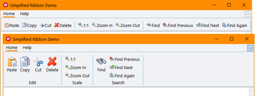
Simplified Ribbon Control in C1 Studio for WPF.Adds Simplified Ribbon contol, new FlexGrid101 Samples, customized icons, plus updates to Scheduler.
Features
- Simplified WPF Ribbon - Improve the look and navigation of your WPF apps with the modern, minimalistic simplified ribbon. This new control occupies the middle ground between a ribbon a toolbar, providing a single-line collapsed state, or a three-line ribbon-like appearance, and its design is influenced by Microsoft's ever-evolving Office 365 ribbon. You can customize the style of the ribbon, as well as the buttons you'd like to include.
- FlexGrid101 Samples - Added a new C1Icon that enables a new level of customization for the sort, filter, and grouping glyphs, as well as FlexGrid101 samples to make it even easier to get started with this popular control. They demonstrate features like selection, cell customization, conditional formatting, filtering, the RowDetails feature, cell merging, and many other points of interest.
- C1Icon - A new object that is used within the FlexGrid to make it much easier to customize the many icons used throughout for sorting, filter, etc. C1Icon allows you to specify your own image, font character, or use a built-in template to change the appearance of the icons found in the data grid.
- Scheduler Updates:
- New TableView Scheduler sample displays appointments in a table view that can be grouped, sorted, or filtered as specified by the developer or end user. It's similar to the Outlook 2016 List and Active views:
- AgendaView displays appointments grouped by date in a table view where a single table row represents a single appointment. Users can edit appointments by double-clicking on an appointment and opening the EditAppointment dialog. This view is always sorted by dates in ascending order, and doesn't have row or column headers.
- New "Working Elsewhere" appointment availability status has been added.
- FlexChart Updates:
- Animations - FlexChart and Finanical Chart now has animations for loading, updating, and changes to the chart axes. You can also create your own custom animations using the AnimationTransform event.
- Scale Breaks - FlexChart has also been updated to support axis scale breaks. Scale breaks can make irregular data that varies by a large magnitude easier to read as it makes the lower end of the scale more visible.
- Ranged drawing mode - allows support for built-in floating bar and Gantt charts. Ranged drawing mode is available for Bar, Column, and Area Charts.
- UWP controls are now available through NuGet.
↧
November 21, 2018, 7:06 am
New Flight Statistics sample in C1 Studio ASP.NET MVC.Adds new Flight Statistics sample, Group Items in ComboBox and ActiveReports support to FlexViewer.
Features
- New Control Designer for ASP.NET MVC - With the newly-enhanced scaffolders, you can use the control wizard to configure controls when you're not using Entity Framework and generate code for a C1 MVC control. In addition to inserting a new control, this now supports updating an existing control definition using the wizard. This wizard can be invoked through the context menu or through Quick Actions in Razor view. This feature is supported in ASP.NET MVC and ASP.NET Core MVC.
- New Flight Statistics Sample - This dashboard-style sample displays flight performance data over time. Controls include FlexGrid with sparkline columns for delay trend and KPI columns. A treemap, bar chart, and line symbol chart are used in to display region-wide statistics, and users can drill down to a specific region and city by selecting the data points. On clicking a region in the Total Flights TreeMap, the FlexGrid displays the details of that region.
- Group items in ComboBox - From the user request folder! With CollectionView already supporting grouping, ComboBox grouping could be implemented with some custom code, but we added this as a simple property in the control itself:
- ActiveReports added to FlexViewer - In addition to FlexViewer's support for ActiveReports, a new Item Template allows you to quickly configure the viewer in your ASP.NET MVC app.
- DashboardDemo updated with Material Design - The DashboardDemo has been updated to include Material Design principles and color schemes. In addition, the DashboardLayout control has been added to the dashboard and analysis tabs.
- FlexGrid Enhancements:
- Use ColumnGroupProvider to create multi-level merged-cell column headers for groups of related columns.
- FlexGrid AccessibilityExtender can be used to easily extend accessibility support in one of two ways; Resize columns using the keyboard (alt+left/right keys). Provide an "alert" method that changes the content of an invisible element with the role "alert." This allows assistive tools to announce grid actions like sorting and filtering.
↧
November 21, 2018, 7:06 am
ComponentOne Studio UWP FlexChartsNew animations for FlexChart and Financial Chart, plus ranged drawing mode for Bar, Column and Area Charts.
Features
- Simplified WPF Ribbon - Improve the look and navigation of your WPF apps with the modern, minimalistic simplified ribbon. This new control occupies the middle ground between a ribbon a toolbar, providing a single-line collapsed state, or a three-line ribbon-like appearance, and its design is influenced by Microsoft's ever-evolving Office 365 ribbon. You can customize the style of the ribbon, as well as the buttons you'd like to include.
- FlexGrid101 Samples - Added a new C1Icon that enables a new level of customization for the sort, filter, and grouping glyphs, as well as FlexGrid101 samples to make it even easier to get started with this popular control. They demonstrate features like selection, cell customization, conditional formatting, filtering, the RowDetails feature, cell merging, and many other points of interest.
- C1Icon - A new object that is used within the FlexGrid to make it much easier to customize the many icons used throughout for sorting, filter, etc. C1Icon allows you to specify your own image, font character, or use a built-in template to change the appearance of the icons found in the data grid.
- Scheduler Updates:
- New TableView Scheduler sample displays appointments in a table view that can be grouped, sorted, or filtered as specified by the developer or end user. It's similar to the Outlook 2016 List and Active views:
- AgendaView displays appointments grouped by date in a table view where a single table row represents a single appointment. Users can edit appointments by double-clicking on an appointment and opening the EditAppointment dialog. This view is always sorted by dates in ascending order, and doesn't have row or column headers.
- New "Working Elsewhere" appointment availability status has been added.
- FlexChart Updates:
- Animations - FlexChart and Finanical Chart now has animations for loading, updating, and changes to the chart axes. You can also create your own custom animations using the AnimationTransform event.
- Scale Breaks - FlexChart has also been updated to support axis scale breaks. Scale breaks can make irregular data that varies by a large magnitude easier to read as it makes the lower end of the scale more visible.
- Ranged drawing mode - allows support for built-in floating bar and Gantt charts. Ranged drawing mode is available for Bar, Column, and Area Charts.
- UWP controls are now available through NuGet.
↧
November 21, 2018, 7:07 am
Material Theme Designer and ASP.NET MVC Control Wizard.New WinForms Material Theme Designer, Simplified Ribbon contol for WPF and Control Wizard for ASP.NET MVC.
Features
Updates in WinForms
- New Material Theme Designer - In addition to adding Material, Material Dark, and Office 2016 Excel Green themes, WinForms now features a Material Theme Designer sample that allows you to set the primary and accent colours of Material theme and save\load them in C1themes format.
- New DataFilter control (beta) - A powerful UI addition, the DataFilter provides an easy, ecommerce-like filter to accompany any data-aware control. You can create filters from datasources, autogenerated, or create them manually. The accordion-based filtering UI can be attached to any control sharing a datasource or plugged into an info screen. The DataFilter is in beta mode and will be launched in 2019 v1.
- New Sparkline control and FlexGrid integration - This lightweight sparkline chart control represents the general shape of data variation in a condensed visual. It's often embedded in grids, and as such, FlexGrid can now display sparklines in columns, and it's now easier to plot trends inside FlexGrid cells. The sparkline property of the FlexGrid column supports plotting line, column, and WinLoss sparklines. You can further customize these sparklines by setting the Axis, markers, and series colours among others.
- FlexGrid now supports SortInfo and GroupInfo, so column information can now be saved and loaded.
- Scheduler's table and agenda views are now launched and out of beta.
- FlexChart now supports animation when loading, updating, and adding new data.
Updates in WPF and UWP
- Simplified WPF Ribbon - Improve the look and navigation of your WPF apps with the modern, minimalistic simplified ribbon. This new control occupies the middle ground between a ribbon a toolbar, providing a single-line collapsed state, or a three-line ribbon-like appearance, and its design is influenced by Microsoft's ever-evolving Office 365 ribbon. You can customize the style of the ribbon, as well as the buttons you'd like to include.
- FlexGrid101 Samples - Added a new C1Icon that enables a new level of customization for the sort, filter, and grouping glyphs, as well as FlexGrid101 samples to make it even easier to get started with this popular control. They demonstrate features like selection, cell customization, conditional formatting, filtering, the RowDetails feature, cell merging, and many other points of interest.
- C1Icon - A new object that is used within the FlexGrid to make it much easier to customize the many icons used throughout for sorting, filter, etc. C1Icon allows you to specify your own image, font character, or use a built-in template to change the appearance of the icons found in the data grid.
- Scheduler Updates:
- New TableView Scheduler sample displays appointments in a table view that can be grouped, sorted, or filtered as specified by the developer or end user. It's similar to the Outlook 2016 List and Active views:
- AgendaView displays appointments grouped by date in a table view where a single table row represents a single appointment. Users can edit appointments by double-clicking on an appointment and opening the EditAppointment dialog. This view is always sorted by dates in ascending order, and doesn't have row or column headers.
- New "Working Elsewhere" appointment availability status has been added.
- FlexChart Updates:
- Animations - FlexChart and Finanical Chart now has animations for loading, updating, and changes to the chart axes. You can also create your own custom animations using the AnimationTransform event.
- Scale Breaks - FlexChart has also been updated to support axis scale breaks. Scale breaks can make irregular data that varies by a large magnitude easier to read as it makes the lower end of the scale more visible.
- Ranged drawing mode - allows support for built-in floating bar and Gantt charts. Ranged drawing mode is available for Bar, Column, and Area Charts.
- UWP controls are now available through NuGet.
Updates in ASP.NET MVC
- New Control Designer for ASP.NET MVC - With the newly-enhanced scaffolders, you can use the control wizard to configure controls when you're not using Entity Framework and generate code for a C1 MVC control. In addition to inserting a new control, this now supports updating an existing control definition using the wizard. This wizard can be invoked through the context menu or through Quick Actions in Razor view. This feature is supported in ASP.NET MVC and ASP.NET Core MVC.
- New Flight Statistics Sample - This dashboard-style sample displays flight performance data over time. Controls include FlexGrid with sparkline columns for delay trend and KPI columns. A treemap, bar chart, and line symbol chart are used in to display region-wide statistics, and users can drill down to a specific region and city by selecting the data points. On clicking a region in the Total Flights TreeMap, the FlexGrid displays the details of that region.
- Group items in ComboBox - From the user request folder! With CollectionView already supporting grouping, ComboBox grouping could be implemented with some custom code, but we added this as a simple property in the control itself:
- ActiveReports added to FlexViewer - In addition to FlexViewer's support for ActiveReports, a new Item Template allows you to quickly configure the viewer in your ASP.NET MVC app.
- DashboardDemo updated with Material Design - The DashboardDemo has been updated to include Material Design principles and color schemes. In addition, the DashboardLayout control has been added to the dashboard and analysis tabs.
- FlexGrid Enhancements:
- Use ColumnGroupProvider to create multi-level merged-cell column headers for groups of related columns.
- FlexGrid AccessibilityExtender can be used to easily extend accessibility support in one of two ways; Resize columns using the keyboard (alt+left/right keys). Provide an "alert" method that changes the content of an invisible element with the role "alert." This allows assistive tools to announce grid actions like sorting and filtering.
↧
↧
November 21, 2018, 7:08 am
ComponentOne UltimateNew Simplified Ribbon for WPF, Control Wizard for ASP.NET MVC, plus updates to WinForms and UWP controls.
Features
Updates in WinForms
- New Material Theme Designer - In addition to adding Material, Material Dark, and Office 2016 Excel Green themes, WinForms now features a Material Theme Designer sample that allows you to set the primary and accent colours of Material theme and save\load them in C1themes format.
- New DataFilter control (beta) - A powerful UI addition, the DataFilter provides an easy, ecommerce-like filter to accompany any data-aware control. You can create filters from datasources, autogenerated, or create them manually. The accordion-based filtering UI can be attached to any control sharing a datasource or plugged into an info screen. The DataFilter is in beta mode and will be launched in 2019 v1.
- New Sparkline control and FlexGrid integration - This lightweight sparkline chart control represents the general shape of data variation in a condensed visual. It's often embedded in grids, and as such, FlexGrid can now display sparklines in columns, and it's now easier to plot trends inside FlexGrid cells. The sparkline property of the FlexGrid column supports plotting line, column, and WinLoss sparklines. You can further customize these sparklines by setting the Axis, markers, and series colours among others.
- FlexGrid now supports SortInfo and GroupInfo, so column information can now be saved and loaded.
- Scheduler's table and agenda views are now launched and out of beta.
- FlexChart now supports animation when loading, updating, and adding new data.
Updates in WPF and UWP
- Simplified WPF Ribbon - Improve the look and navigation of your WPF apps with the modern, minimalistic simplified ribbon. This new control occupies the middle ground between a ribbon a toolbar, providing a single-line collapsed state, or a three-line ribbon-like appearance, and its design is influenced by Microsoft's ever-evolving Office 365 ribbon. You can customize the style of the ribbon, as well as the buttons you'd like to include.
- FlexGrid101 Samples - Added a new C1Icon that enables a new level of customization for the sort, filter, and grouping glyphs, as well as FlexGrid101 samples to make it even easier to get started with this popular control. They demonstrate features like selection, cell customization, conditional formatting, filtering, the RowDetails feature, cell merging, and many other points of interest.
- C1Icon - A new object that is used within the FlexGrid to make it much easier to customize the many icons used throughout for sorting, filter, etc. C1Icon allows you to specify your own image, font character, or use a built-in template to change the appearance of the icons found in the data grid.
- Scheduler Updates:
- New TableView Scheduler sample displays appointments in a table view that can be grouped, sorted, or filtered as specified by the developer or end user. It's similar to the Outlook 2016 List and Active views:
- AgendaView displays appointments grouped by date in a table view where a single table row represents a single appointment. Users can edit appointments by double-clicking on an appointment and opening the EditAppointment dialog. This view is always sorted by dates in ascending order, and doesn't have row or column headers.
- New "Working Elsewhere" appointment availability status has been added.
- FlexChart Updates:
- Animations - FlexChart and Finanical Chart now has animations for loading, updating, and changes to the chart axes. You can also create your own custom animations using the AnimationTransform event.
- Scale Breaks - FlexChart has also been updated to support axis scale breaks. Scale breaks can make irregular data that varies by a large magnitude easier to read as it makes the lower end of the scale more visible.
- Ranged drawing mode - allows support for built-in floating bar and Gantt charts. Ranged drawing mode is available for Bar, Column, and Area Charts.
- UWP controls are now available through NuGet.
Updates in ASP.NET MVC
- New Control Designer for ASP.NET MVC - With the newly-enhanced scaffolders, you can use the control wizard to configure controls when you're not using Entity Framework and generate code for a C1 MVC control. In addition to inserting a new control, this now supports updating an existing control definition using the wizard. This wizard can be invoked through the context menu or through Quick Actions in Razor view. This feature is supported in ASP.NET MVC and ASP.NET Core MVC.
- New Flight Statistics Sample - This dashboard-style sample displays flight performance data over time. Controls include FlexGrid with sparkline columns for delay trend and KPI columns. A treemap, bar chart, and line symbol chart are used in to display region-wide statistics, and users can drill down to a specific region and city by selecting the data points. On clicking a region in the Total Flights TreeMap, the FlexGrid displays the details of that region.
- Group items in ComboBox - From the user request folder! With CollectionView already supporting grouping, ComboBox grouping could be implemented with some custom code, but we added this as a simple property in the control itself:
- ActiveReports added to FlexViewer - In addition to FlexViewer's support for ActiveReports, a new Item Template allows you to quickly configure the viewer in your ASP.NET MVC app.
- DashboardDemo updated with Material Design - The DashboardDemo has been updated to include Material Design principles and color schemes. In addition, the DashboardLayout control has been added to the dashboard and analysis tabs.
- FlexGrid Enhancements:
- Use ColumnGroupProvider to create multi-level merged-cell column headers for groups of related columns.
- FlexGrid AccessibilityExtender can be used to easily extend accessibility support in one of two ways; Resize columns using the keyboard (alt+left/right keys). Provide an "alert" method that changes the content of an invisible element with the role "alert." This allows assistive tools to announce grid actions like sorting and filtering.
↧
November 26, 2018, 2:24 am
AutoCompleteView in Telerik UI for Xamarin.AutoCompleteView adds DisplayTextFormatter to easily change Text in the Entry or the Tokens on selection.
Features
- AutoCompleteView
- Added DisplayTextFormatter which allows you to easily change the Text in the Entry (if the DisplayMode is Plain) or in the Tokens on selection.
Fixes
- AutoCompleteView
- Filtering is not performed when ShowSuggestionView is set to False.
- [iOS] Both NoResultMessage and Suggestions are shown when there isn't a match.
- [Android] Popup flickers when filtering is performed.
- ArgumentNullException is thrown when the Text is null and ShowSuggestions is called.
- [Android] Suggestions could not be selected on LG devices.
- Calendar
- [UWP] Appointments from the next and previous month are not visible in MonthView.
- [Android] Exception is thrown in DayView when read from screen reader.
- Common
- [UWP]: RadCheckBox, RadNumericInput and RadButton could not be rendered while debugging in Windows 1809.
- DataGrid
- [UWP] ArgumentException is thrown when filtering icon is clicked.
- Entry
- [UWP] TextColor property is not applied.
- NumericInput
- When the Minimum is set, trying to add decimal separator after typing the minimum value causes undesired effects.
↧
November 29, 2018, 8:35 am
MindFusion.Virtual Keyboard for WinFormsNew method lets you override key labels for a given language.
Features
Key improvements
- The UnicodeKey class can send any Unicode symbol as input to target text controls.
- The RegularKey "Values of Content" property can now be sent to external processes.
Keyboard improvements
- A new Windows10 color scheme added to Theme enumeration.
- SetKeyLabels method lets you override key labels for a given language.
Active window tracking
- The control updates its layout immediately when a window with a different current language activates.
- Pressing a key no longer activates last target window which led to activation flickering.
Miscellaneous
- Move multiple selected keys in keyboard creator.
↧
December 5, 2018, 12:39 am
Elegant RibbonAdds support for Microsoft Visual Studio 2017.
Features
- Added support and tested for compatibility with Microsoft Visual Studio 2017.
- The samples are updated to illustrate the new features.
Fixes
- ComboBox with AutoCompleteSource doesn't work on ribbon.
- Fixed some other minor bugs.
↧
↧
December 6, 2018, 6:21 am
jQWidgetsAdds Angular Modules for all components.
Features
- Added Angular Modules for all components.
- When the Grid calls the DataAdapter's sort function, it now passes an additional third parameter which contains all sort columns and sort directions.
Fixes
- Issue in the rendering of jqxTree with checkboxes and jqxEditor with Material styles.
- Issue in jqxGrid regarding the multiple-column sorting of Date columns.
- Issue in jqxGrid regarding the multiple-column sorting in virtual mode. Even when there is no data, the sort arrows are rendered as in the single-sort mode.
- Issue in jqxScheduler regarding jQuery 3.3.1 and rendering of appointments on IPad in MonthView.
- Issue in jqxDateTimeInput regarding dates selection before 1970.
- Issue in jqxTreeGrid regarding the export to excel when aggregates are turned on.
- Issue in jqx.base.css file regarding *expression css names.
↧
December 7, 2018, 1:48 am
Excel-inspired Formula BarAdds Spreadsheet Formula Bar component to allow end-users to easily manage formulas in worksheets.
Features
- Right-To-Left Support - The v18.2 release introduces Right-to-Left (RTL) support with the following DevExpress VCL components:
- Grid Control
- TreeList Control
- Layout Control
- Skin Form
- and the majority of the editors
- Spreadsheet
- Excel-inspired Formula Bar - This release introduces a Formula Bar component that you can integrate with the Spreadsheet Control to allow end-users to easily manage formulas in worksheets.
- New Document-based Report Link - The new report link generates a report using the print area, print titles, page margins, and other print options specified in a document.
- Improved Performance
- More responsive UI - it's two times faster than in previous versions.
- Array formulas are calculated 10 times faster when compared with previous versions.
- Significantly improved performance when displaying merged cells whose text is wrapped into multiple lines, especially when it includes CJKV (Chinese, Japanese, Korean, Vietnamese) characters or glyphs.
- New Style Galleries for Generated UI - When generating a Ribbon/Toolbar UI for the VCL Spreadsheet Control, you can now add the Conditional Formatting Rule Style galleries, which are similar to those in Microsoft Excel. They display available icon sets and miniature previews of formatting applied to data bars and color scales. The following UI elements are now represented as galleries:
- The Margins and Paper Sizes options on the Page Setup toolbar/ribbon group.
- The formula categories and calculation options on the Formulas toolbar/ribbon group.
- TreeList and Vertical Grid
- DevExpress continue to extend these controls with the filtering options available in the Grid control. This release adds filter dropdowns to tree list columns and vertical grid rows. As you might expect, the controls, columns, and rows offer numerous options to customize the display and behavior of the filter dropdowns.
- Miscellaneous
- The Layout, Page, and Tab controls can now display tab captions across multiple lines. Either add line breaks manually or specify a tab width to enable caption wrapping.
- Optimized Package List - This release merges the packages containing the Layout Control, Editors, Data Controller, Page Control, and XP Theme Manager into the Cross-Platform Library to reduce the number of packages your IDE loads at startup and thereby improve its performance.
- Icon Library - New SVG Images - This release extends the icon library with nearly 2,000 new SVG images.
↧
December 7, 2018, 1:52 am
Icon Library - New SVG ImagesExtends the icon library with nearly 2,000 new SVG images, plus introduces RTL support.
Features
- Right-To-Left Support - The v18.2 release introduces Right-to-Left (RTL) support with the following DevExpress VCL components:
- Layout Control
- NavBar Control
- Tabbed MDI Manager
- Page and Tab Controls
- Skin Form
- and the majority of the editors
- Miscellaneous
- The Layout, Page, and Tab controls can now display tab captions across multiple lines. Either add line breaks manually or specify a tab width to enable caption wrapping.
- Optimized Package List - This release merges the packages containing the Layout Control, Editors, Data Controller, Page Control, and XP Theme Manager into the Cross-Platform Library to reduce the number of packages your IDE loads at startup and thereby improve its performance.
- Icon Library - New SVG Images - This release extends the icon library with nearly 2,000 new SVG images.
↧